Convoy
An app and wearable ring that helps women who walk alone at night feel safer about their surroundings through community data.
Overview
Problem
In the United States, 45% of women report they do not feel safe walking alone at night, as compared to 27% of men .
Women take precautionary measures such as rearrange or limit their plans to only be out in daylight, walk different routes, and inform loved ones of their locations. With such statistics that demonstrate the problem’s impact, existing products on the market use everything from wearable bracelets and panic buttons to location sharing and police networks to address this issue. However, no one solution in the space of women’s safety are robust in adequately assisting or protecting women while also helping them stay aware of their surroundsings.
Solution
Our team wanted to explore creating a system that could empower women with information that helped them feel safer at night. We came up with Convoy, a mobile application and wearable suite to address the feelings of insecurity that women who walk alone at night feel.
Convoy is an app that connects users with credible data taken from crime reports, prioritizing what aspects in a surrounding area make them feel safer, and aiding them in picking safer walking routes.
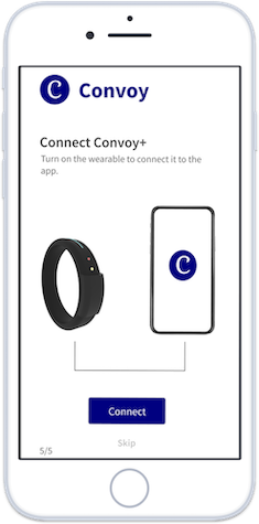
This app can be paired with Convoy+, a wearable ring that uses haptic feedback and lights to convey route information from the app to users. This information can help women feel more secure about their surroundings and more safe when they travel.
Contribution
As the lead UX researcher, I designed and created our interview protocol and survey, recruited participants and conducted interviews, identified relevant evaluation metrics for Convoy and Convoy+, and led Convoy’s usability testing. I additionally aided in the creation of concept sketches, wireframes and the information architecture.
I served as the project master for the end of our design phase in this time I defined the meeting agendas, prioritized tasks by identifying team strengths and supported team members, led discussions, and served as a point of contact for users and external resources.
Logistics
Process
1. Generative Research
Secondary Research
Competitive Analysis
Semi-structured Interviews
Survey
Task Analysis
Design Implications
2. Iterative Design
Informed Brainstorming
Divergent Designs
Wireframes
High-Fidelity Prototype
3. Evaluative Research
Moderated Usability Testing
Design Implications
Generative Research
Secondary Research
Goals:
By looking at existing news articles, safety and crime statistics, and other desktop research sources, we were able to better understand the population most affected by safety concerns while walking at night. At the end of this phase of our research, we determined that young working women in cities are our primary users, with an emphasis on women not very familiar with the area. Through further generative research, we hoped to understand our user’s actions and feelings and evaluate the current state of women’s safety products.
Competitive Analysis
After understanding our problem space, our team studied safety applications and wearable technology aimed at keeping women safe. We wanted to understand what products on the market were offering and areas they could be improved.
We created a chart to compare the features offered by each product. By comparing the products, we saw that each product catered to a specific safety need. Therefore, users would have to have multiple products in order to get all the features that they may need.
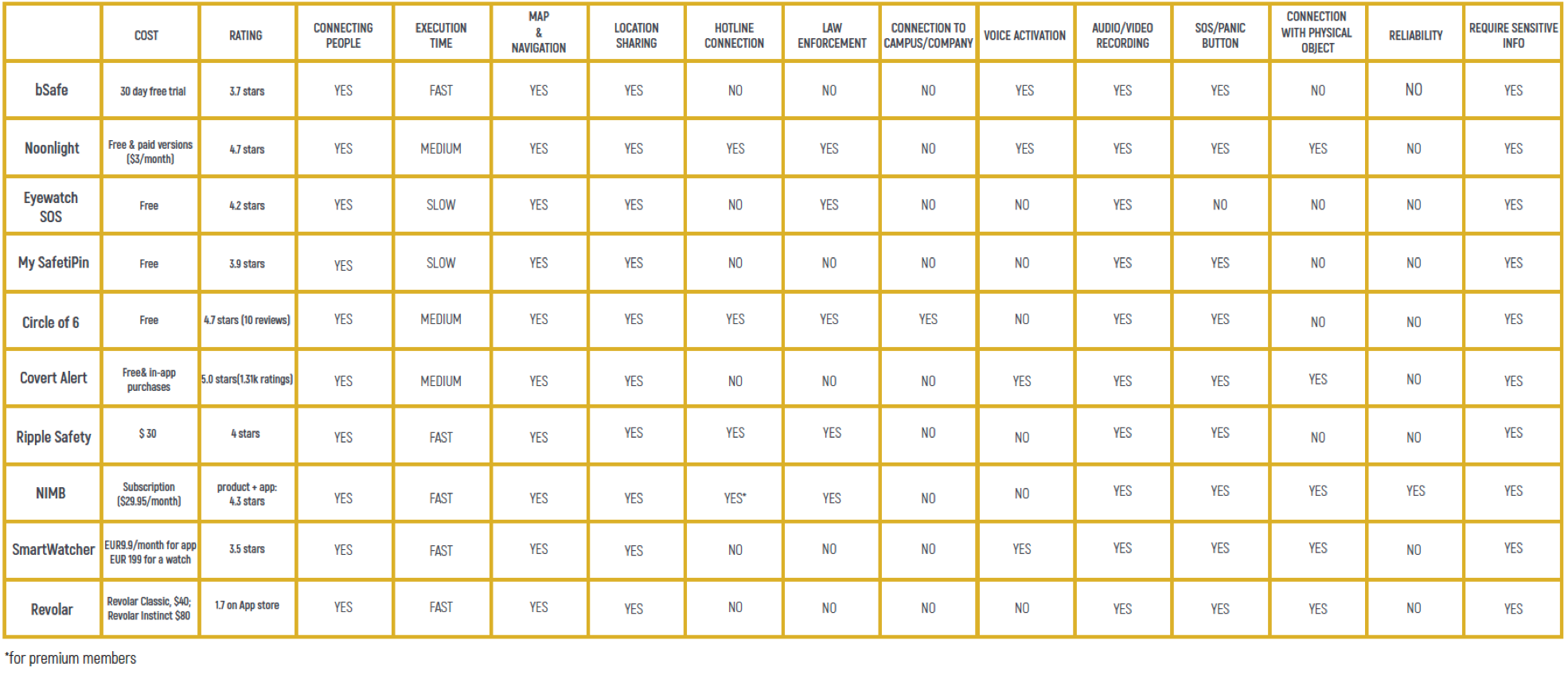
Findings
Based on the commonly seen features in existing products, we noticed that users wanted the ability to a contact a source like their family as quickly as possible. One of the biggest issues with current products is that the tolerance for errors is low - if a user accidentally presses a panic button on the device that signals for help, the device does not provide the ability to reverse their actions. This fear of making an error causes unneccsary stress to the users, resulting in them not wanting to use the device for protection in unsafe situations.
Our team prioritized the following functionalities to include in our solution:
- 1. A seamless and fast connection to contact family and friends, a hotline, and/or police.
- 2. A map of the surrounding neighborhood to help with navigation and obtain safety information.
- 3. Feedback to indicate actions are being performed and that the device is responding.
Discovery Interviews
At the start of this research phase, we hypothesized that a few stressors women have about walking alone at night include needing to avoiding strangers, not having weapons to defend themselves, difficulty calling the police , and making sure to have their phone in their hands to reach out to someone.
Method Details
To better understand our users experiences and garner support for our hypothesis, we conducted semi-structured interviews with 9 female participants between 18-35 years old living in or near a big city .
During the interview, we asked open-ended questions relating to their experiences being in unsafe situations, how they perceive safety, and what actions they take in response. We also had participants write about conditions that make them feel safe or unsafe.
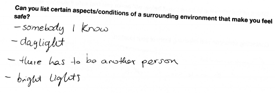
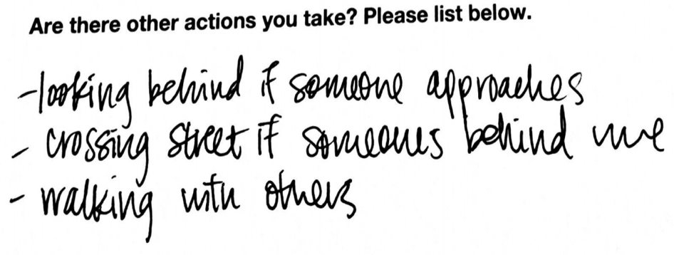
Sample Written Answers
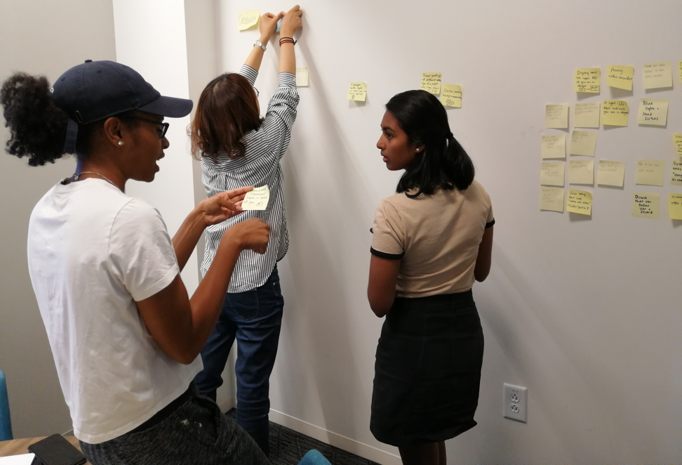
Affinity Mapping
To analyze our findings, the team built an affinity map to quickly sift through qualitative findings before jumping to solutions. We grouped related notes and created a hierarchy with 5 major themes - News/Media, People's Feelings, Infrastructure, Staying Alert, and Familiarity with Surroundings.
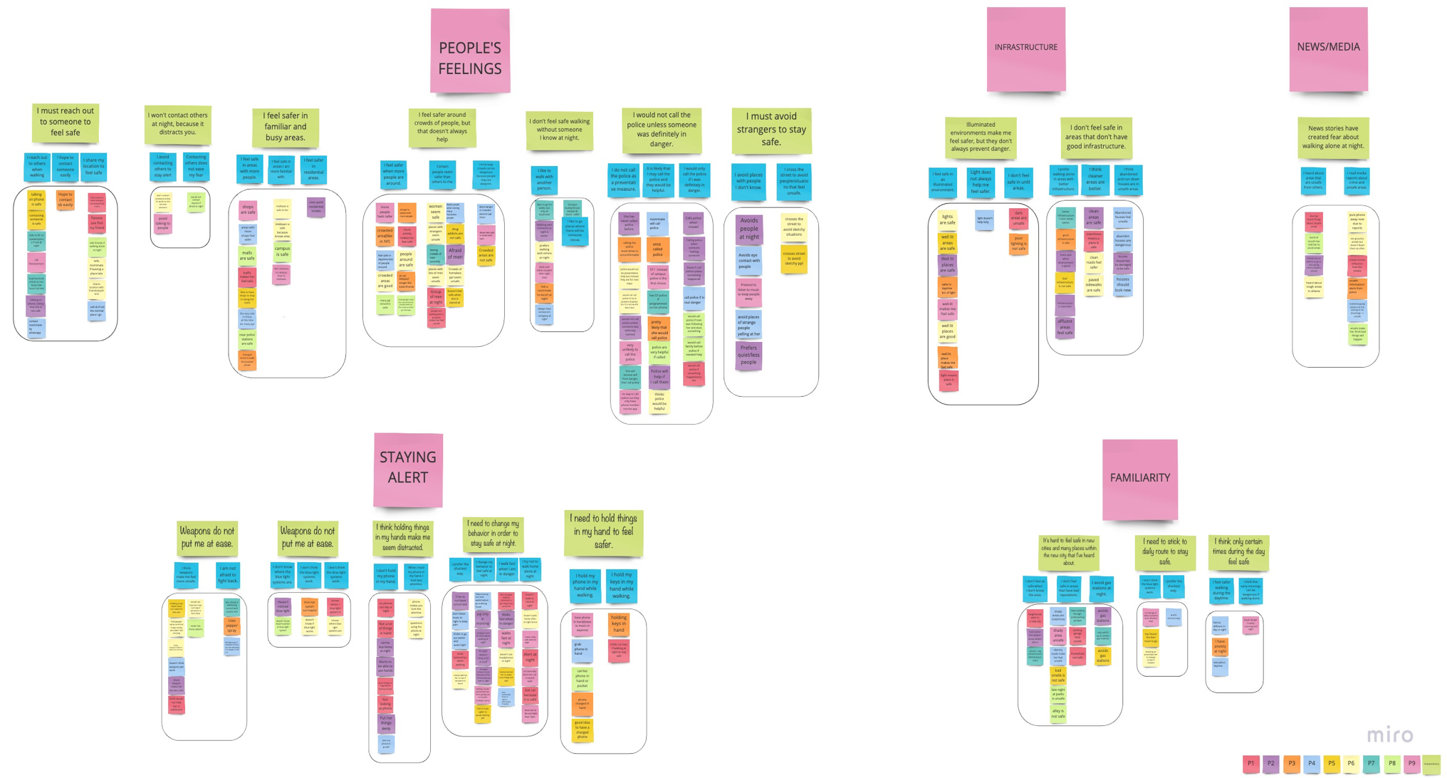
Top Findings:
- 1. Compared to more familiar areas, unfamiliar areas make users feel less safe.
- 2. There is a desire not to be alone, so users contact others.
- 3. Users feel uncomfortable reaching out to police if they are in danger.
- 4. Busier areas make users feel safe.
- 5. Users feel safer walking with a buddy.
- 6. Media and external rumors shape the perception of how safe an area is.
Survey
We administered a follow-up survey to obtain quantitative data and compare and contrast the survey answers with the information our participants shared verbally during the interview.
Details:
Findings:
We used Google Forms automatically generated bar and pie charts to view the distribution of responses. The scale is 1 = Never, 5 = Always
Overall, from survey data, we saw that women aim to stay alert, stick to a walking routine/familiar paths, and avoid areas that tend to be assosciated with lower safety .
External Contact takeaways:
A majority of our respondents revealed that they would prefer to not be walking alone .
69.4% of participants said they would have company while walking .
88.8% of women preferred to reach out to someone while walking.
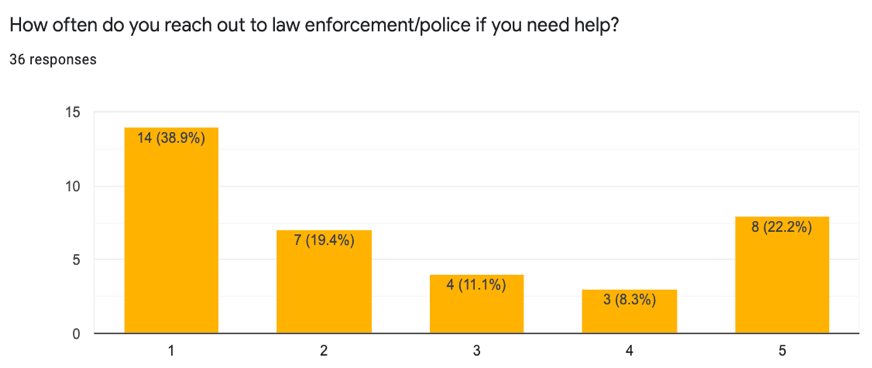
69.4% of our respondents stated that they would not reach out to the police if they needed help.
Safety takeaways:
When asked about staying safe, participants responded they tend to seek out areas that are:1. well lit
2. well-maintained
3. streets are more crowded
69.5% of our respondents stated that they felt unsafe holding a weapon (like pepper spray).
Task Analysis
From the interview and survey data, I created task analysis diagrams to represent the various scenarios that involve women walking alone at night. The task analysis helped us identify all the smaller actions users engage in as they begin walking. As they walk in an urban environment, they experience many sounds and sights and need a solution that does not distract them from their surrounding awareness. We initially found it difficult to break down a vague task like this, but we soon were able to identify a pattern among the tasks that our users followed depending on the context.
The three situations we explored are:1. Traveling alone during the day to their destination
2. Traveling alone during the night to their destination
3. Escaping from an unsafe situation at night
Below is the task analysis chart for Escaping from an unsafe situation at night.
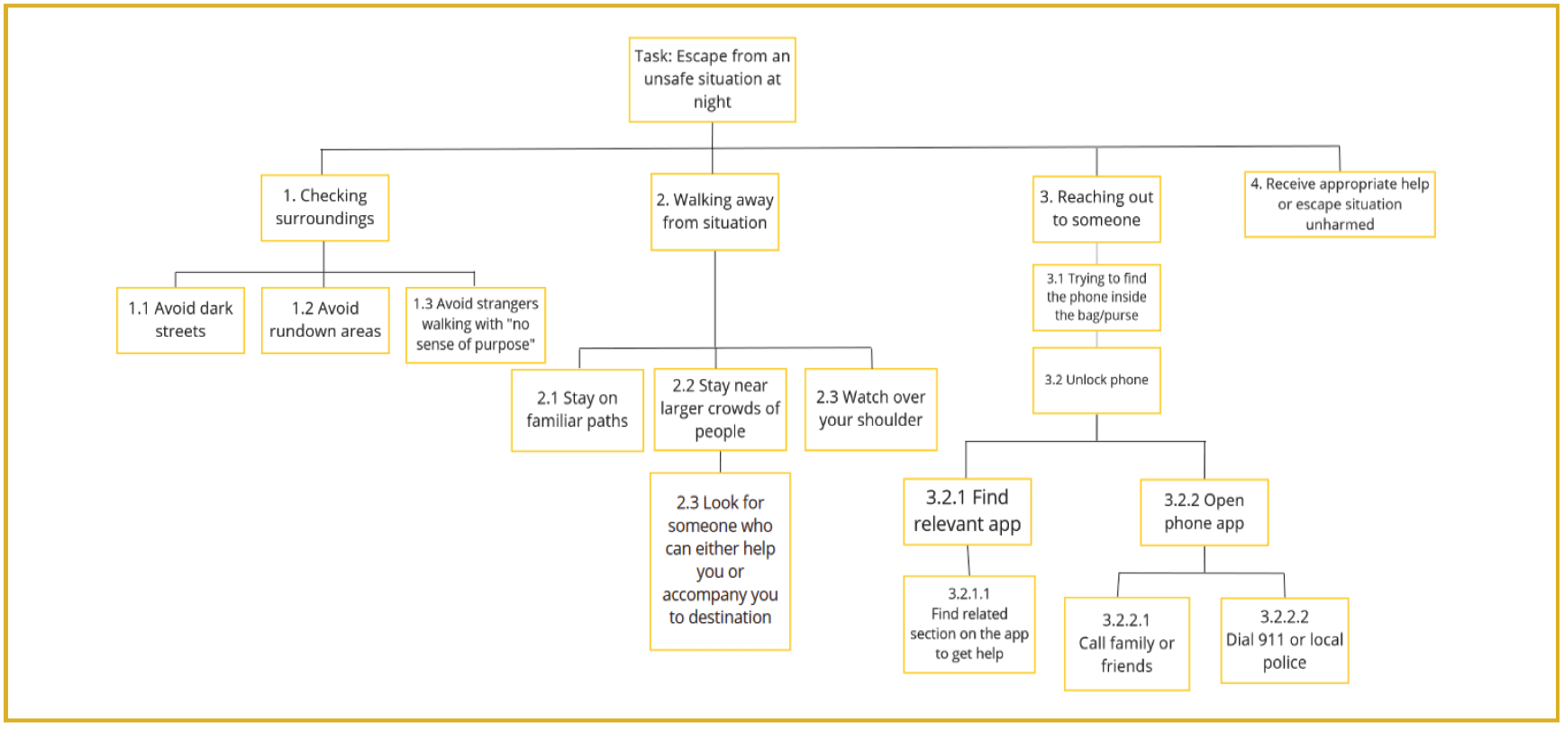
Tasks 1 to 3 are arranged in likelihood of increased agitation occurring. The user progressively feels unsafe and therefore engages in more active behavior. The tasks have potential to occur simultaneously too (for example, a user might constantly be looking over their shoulder as they are reaching for their phone). Overall, the level of variability increases in this scenario because the context fluctuates.
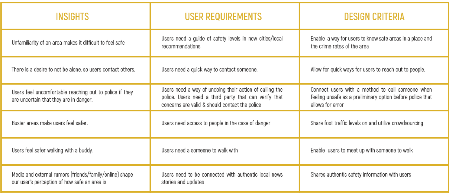
Design Implications
Through generative research, I explored the challenges, fears, and worries faced by young adult women when they are walking alone at night. As a team, we took the main pain-points we identified from our research and developed criteria that our solutions should aim to include. They are presented below in this table.
Refined Problem Statement
From identifying our users primary pain points, we refined the scope of our design to address the following questions:
How can we connect users to others seamlessly while still allowing them to be aware of their surroundings?
How can we display safety reports and authentic news stories in an understandable manner?
Design
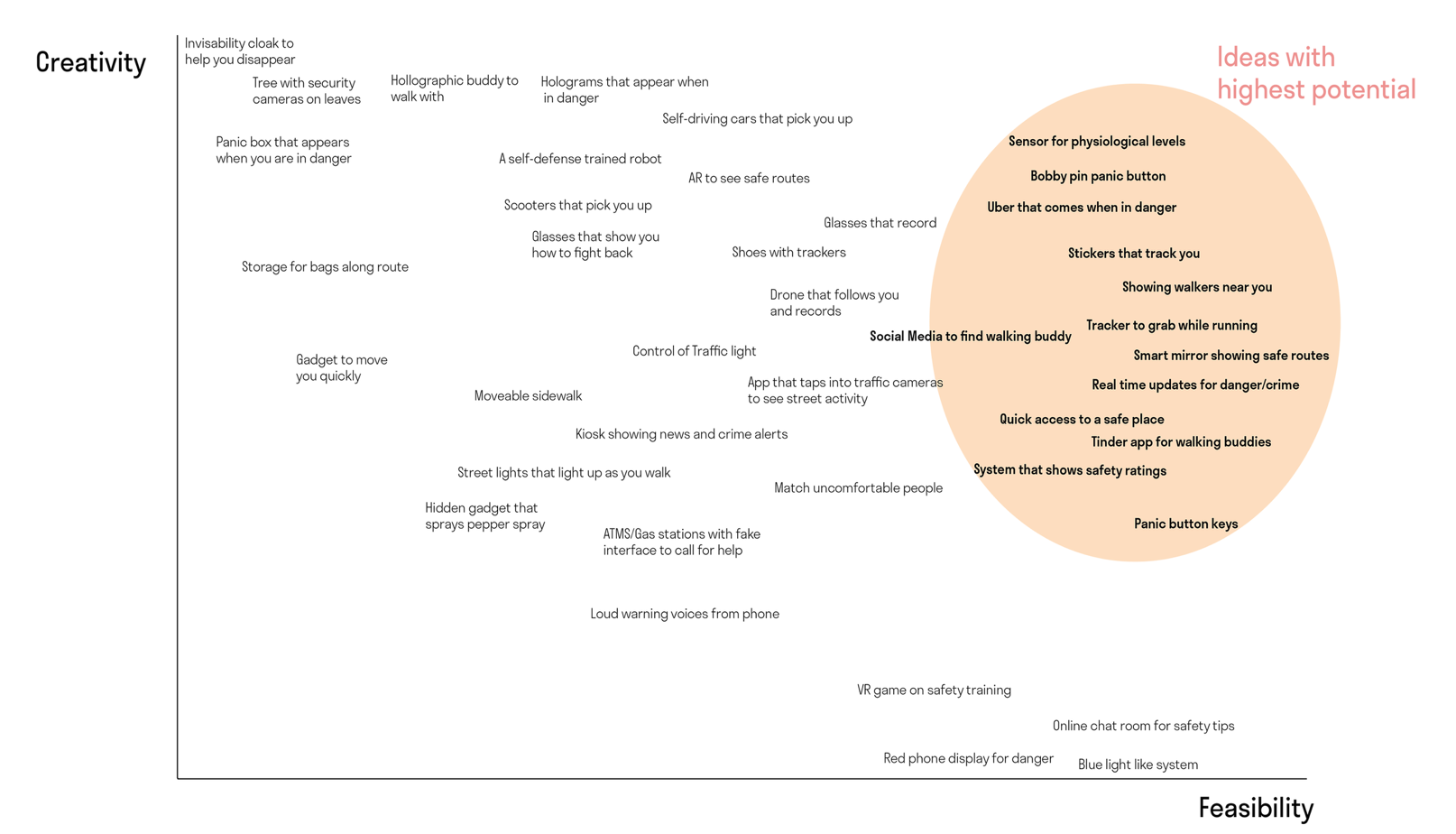
Informed Brainstorming
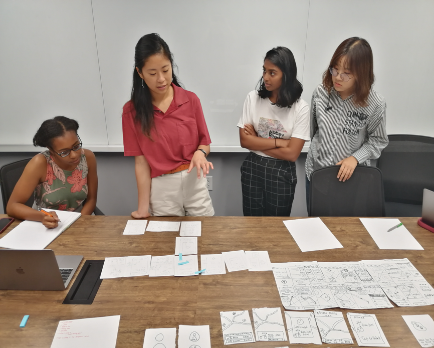
Our refined problem statement and exploratory user research enabled our team to conduct an informed brainstroming session to generate solutions. As a team, we wrote potential ideas on sticky notes. We created a Creativity vs Feasbility chart which enabled us to categorize each idea on a uniform scale.
At the end of this session, we narrowed down to ideas with high creativity and feasibility. Although we wanted our idea to be novel, we did not want to build an impractical solution that did not align with current technological capabilities.
Divergent Solutions
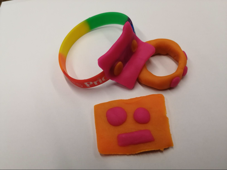
We noticed a central theme arising from our four design ideas; women wanted to be connected to some external resources or information that could help them feel safe. Using our Creativity vs. Feasbility chart, we drilled down on our ideas to create three divergent designs that still addressed our fundamental problem, and we also quickly brainstormed the pros and cons of each design idea. As a team, we sought user feedback to help refine these ideas and create low-fidelity wireframes to determine each solution’s functionality. I created the low-fidelity wireframes in Sketch for the Local Buddy divergent design idea.
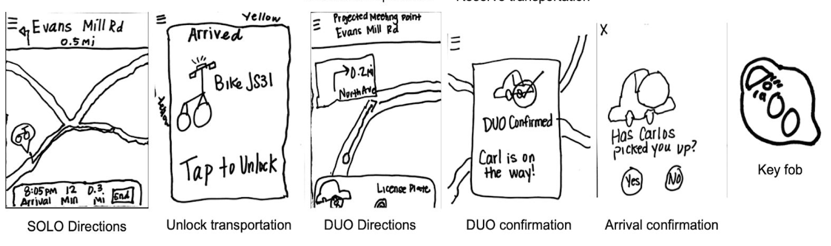
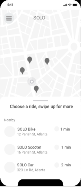
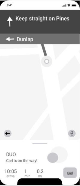
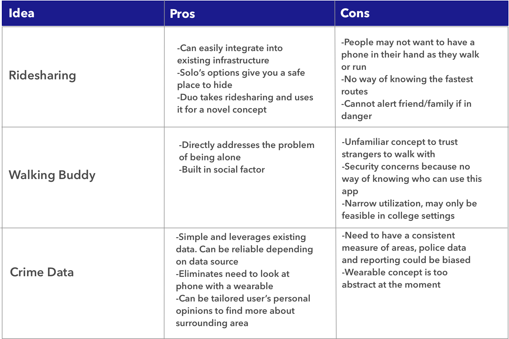
This solution presents users with an application and key fob that can tap into existing transportation to remove themselves from dangerous situations. In the SOLO mode, users can find nearby bikes, rental cars, or scooters to unlock and drive away. In DUO mode, users can find and be directed to a projected meeting spot for pickup by a trusted rideshare service.
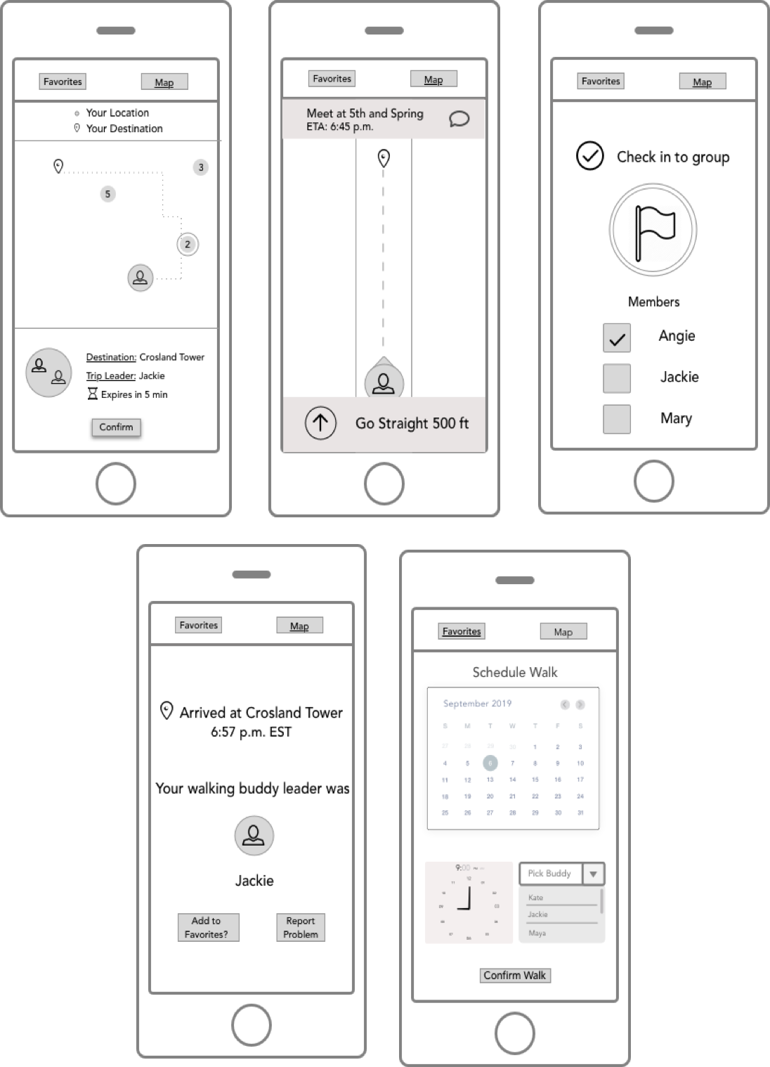
Idea 2: Walking Buddies
This solution is a location-based social search app that provides one with walking buddies as they travel to a destination. Through the app, one can identify nearby groups led by a walking leader, schedule walking trips in advance, and meet new friends as they walk to common destinations.
Idea 3: Crime Data + Wearable
This solution is a mobile app and a wearable device that tells one the safest route based on data from local police departments. It intends to connect users with the right information as soon as possible. The wearable guides the user to the safest route and enables them to connect with others in emergencies.
Narrowing Down the Designs
To decide on a single design idea, we presented these 3 concepts to three users by having them interact with paper prototypes of each design idea in a quick usability interview. The interview had two parts: A feature-scenario matching exercise as well as a think-aloud usability test.
1. Feature-Scenario Matching
We came up with four scenarios related to our problem as well as a table with potential features/functionality that our final design could include. As the session moderator, I read these scenarios to participants as they studied this table, and they selected five features that they want to use in that given scenario.
Top Findings
Location sharing with friends and family
To be able to know safe locations
A simple word that activates multiple actions (call contacts/police, sending location)
Information about surroundings
Be near a crowd of people
2. Think-Aloud Usability Testing
Because we had three design ideas, 3 members took charge of presenting each participant with sample tasks for one design idea. The other team member served as a notetaker. The participant responded to each task by using the paper prototype to walk through how they would use the design to accomplish the given task. Because this was a think-aloud, we were able to get their opinions about each design idea, assess their nonverbal cues and immediate reactions to each design.
Additionally, we pitched our three ideas to our peers and professors in a poster session to get additional feedback.
As a team, we created a Pros and Cons table to capture other issues and strengths each design idea that were not previously discussed before.
The Final Decisions
After hearing the feedback from our users and peers, we decided to move forward with the Crime Data design idea. We renamed the app to be Convoy and the supporting wearable to be Convoy+.
The main reasons behind this decision are:
Low Fidelity Flow - Convoy
Goals
Iteration 1 - Convoy
Goals
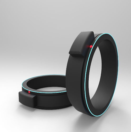
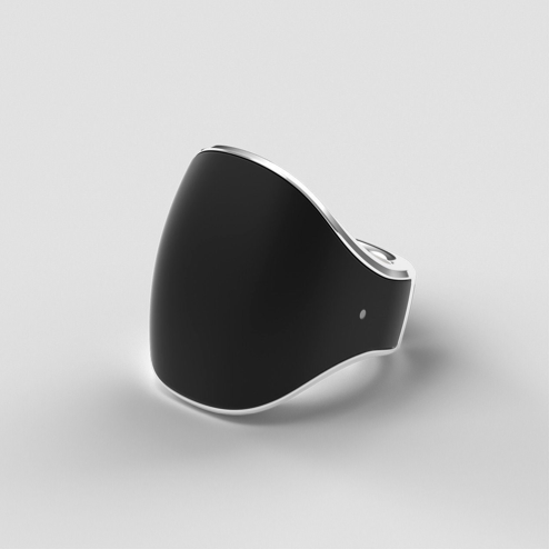
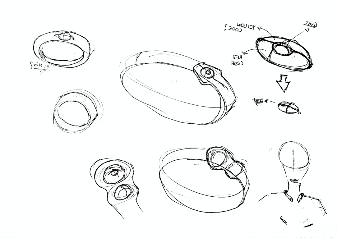
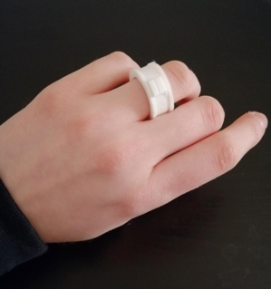
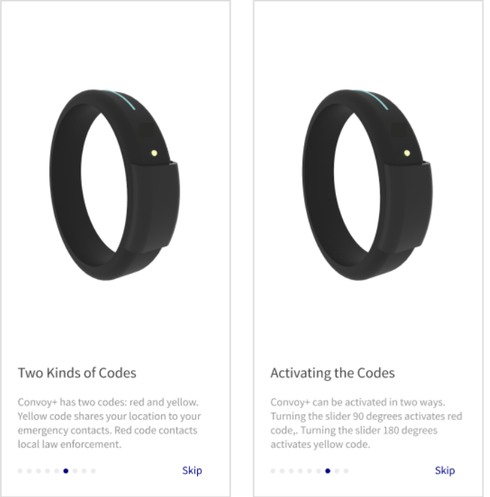
Iteration 1 - Convoy+
We orignally imagined Convoy+ to be a wearable ring with a sliding component that users move to send red or yellow emergency alerts and see the corresponding lights. The wearable uses blinking lights and different light patterns to indicate actions have been performed and communication with the user. It also provides haptic and auditory feedback to provide information about destinations, tell users about routes, and deliver other updates.
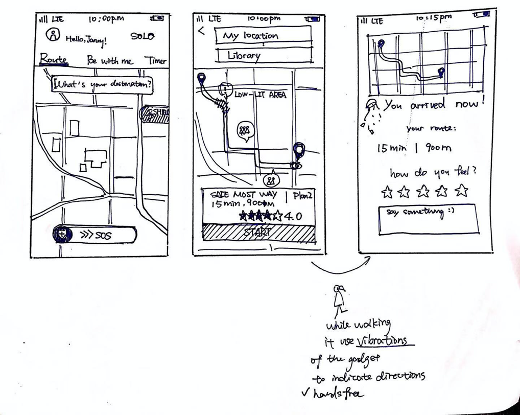
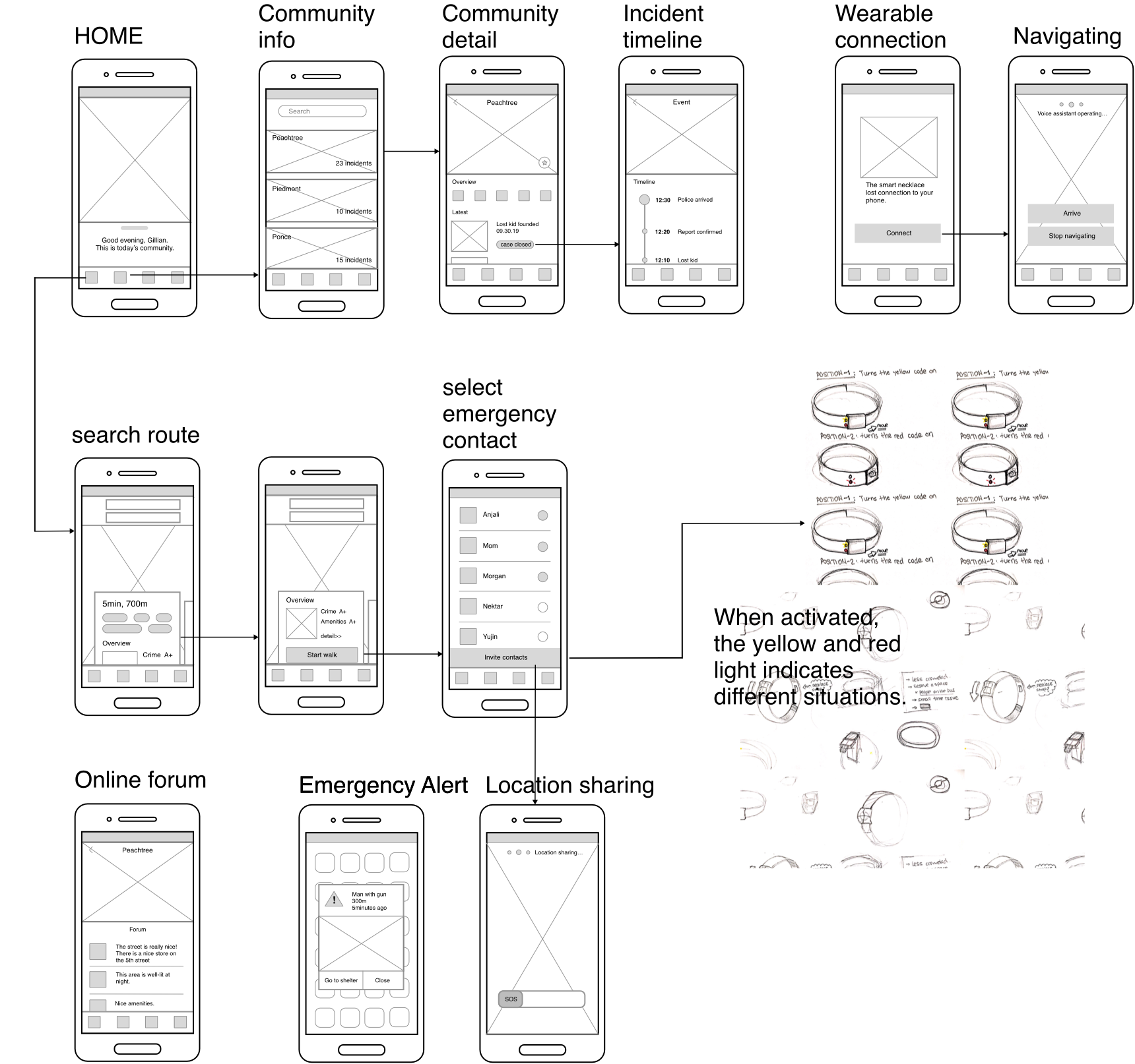
Final Prototype - Convoy
Key Features and Screens walkthrough
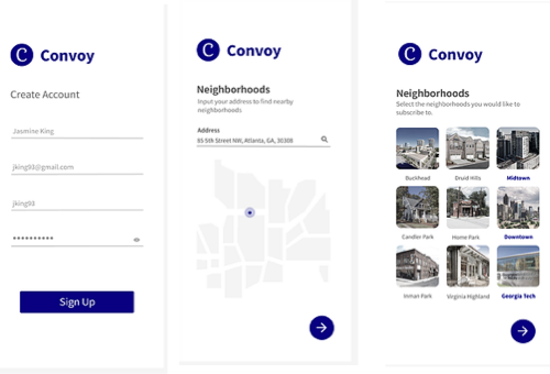
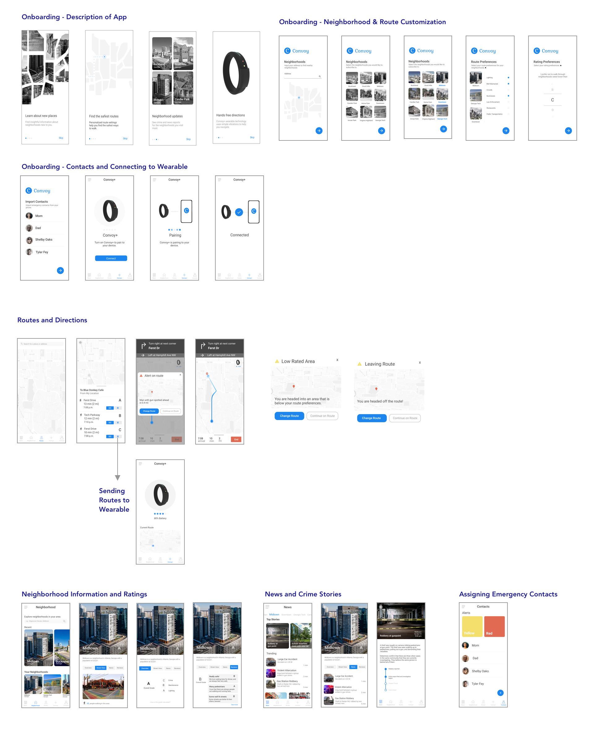
Set up Account
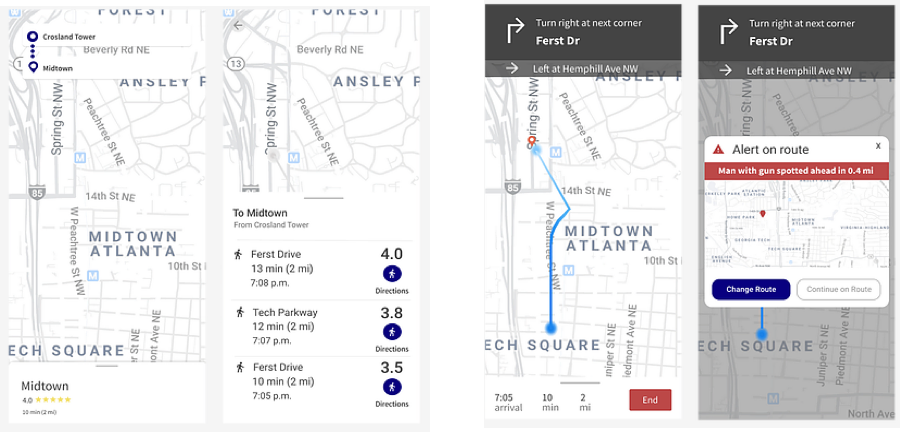
A user can enter their location to see nearby neighborhoods and choose ones she wants to receive more information about.
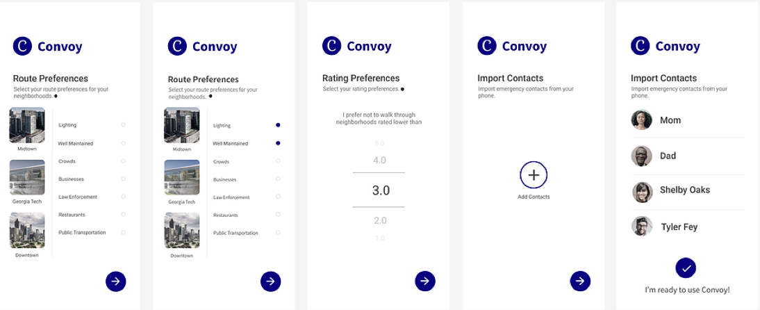
Customize Safety Preferences
The user can indicate the top attributes of their route that they prioritize for safety and set a bottom limit for route ratings. Additionally, they can add their loved ones to the app and assign when contact should be notified depending on the level of emergency.
Neighborhood Information and Crime Reports
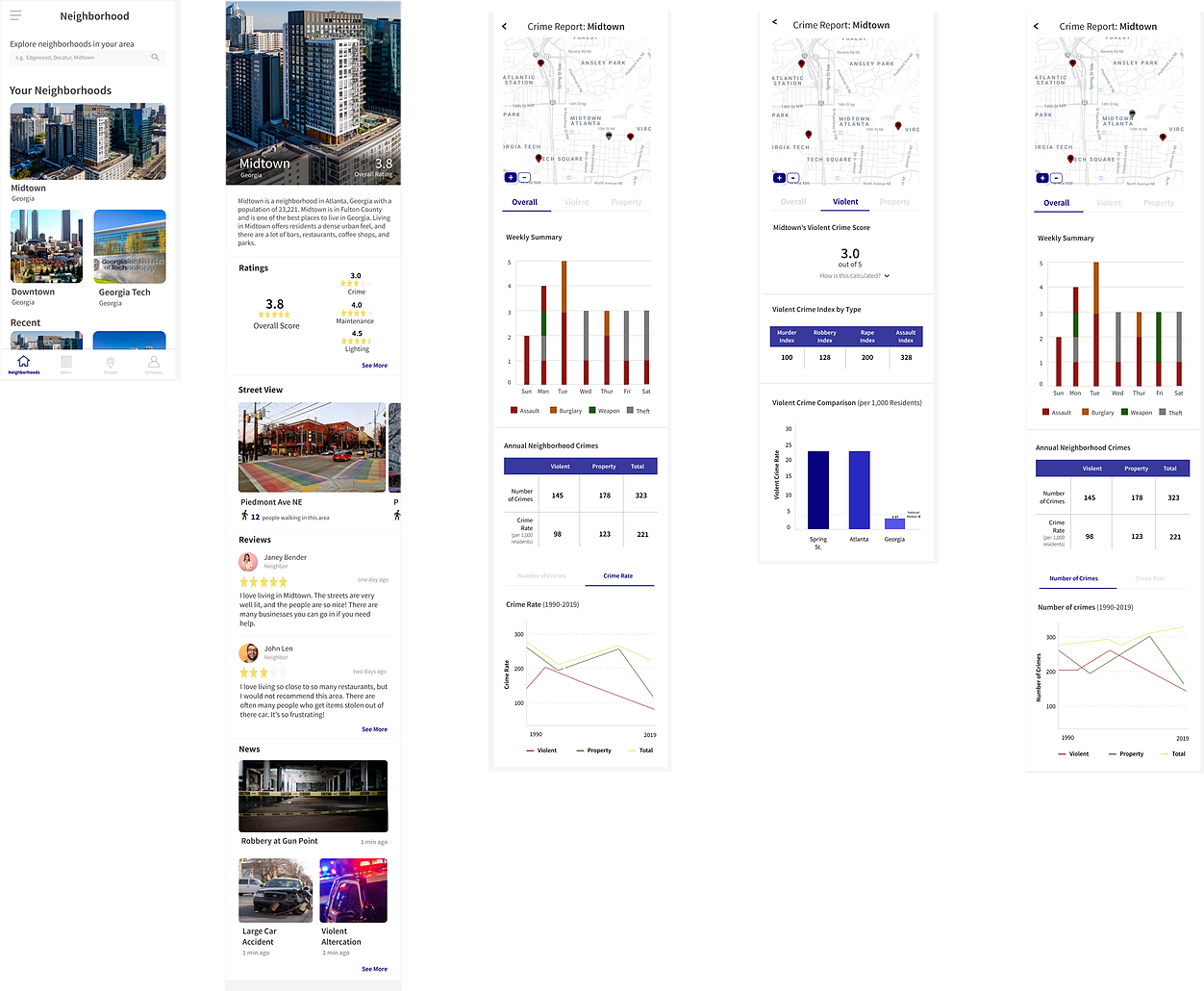
Once a user selects a neighborhood, they will see an overall rating of the area as well as specific ratings corresponding to the crime level, lighting conditions, and maintainence of the area. By scrolling, users see pictures of the neighborhood’s streets, reviews left by people living in that neighborhood, and any latest news stories occuring in that neighborhood.
The lighting and maintainence score is compiled from local reviews. However, the crime rating comes from local police data and the user can see multiple breakdowns and representations of the crime data to see the top crimes in the neighborhood, the crime evolution, and how that neighborhood compares to other parts of Atlanta.
News Stories
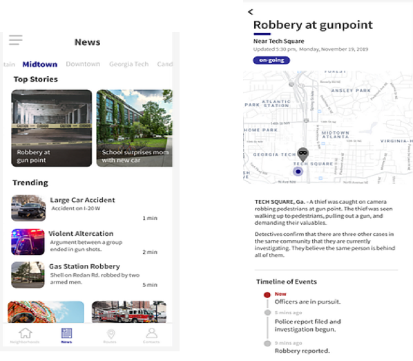
Users can also see news reports and crime stories for neighborhoods they subscribe to. By clicking on a news story card, they are redirected to a view that shows the exact location and a brief description of the incident, as well as trending updates if applicable.
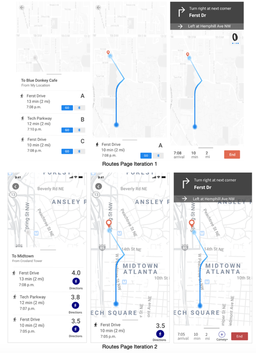
Directions
Convoy will also show users the overall rating of the route, how far they will have to walk, how long it will take, and the time that they will arrive. If users press the “Directions“ button, they will be given directions to the route they selected. The wearable, Convoy+, can be paired and give haptic feedback directions.
Pairing
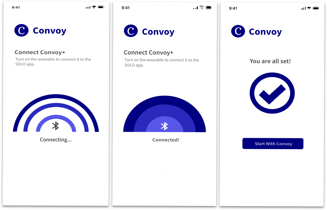
Users can pair their Convoy app with Convoy+ to be guided during their walking trip. Convoy+ will provide haptic and audio feedback about the walking trip so users do not need to look at their phone as they walk.
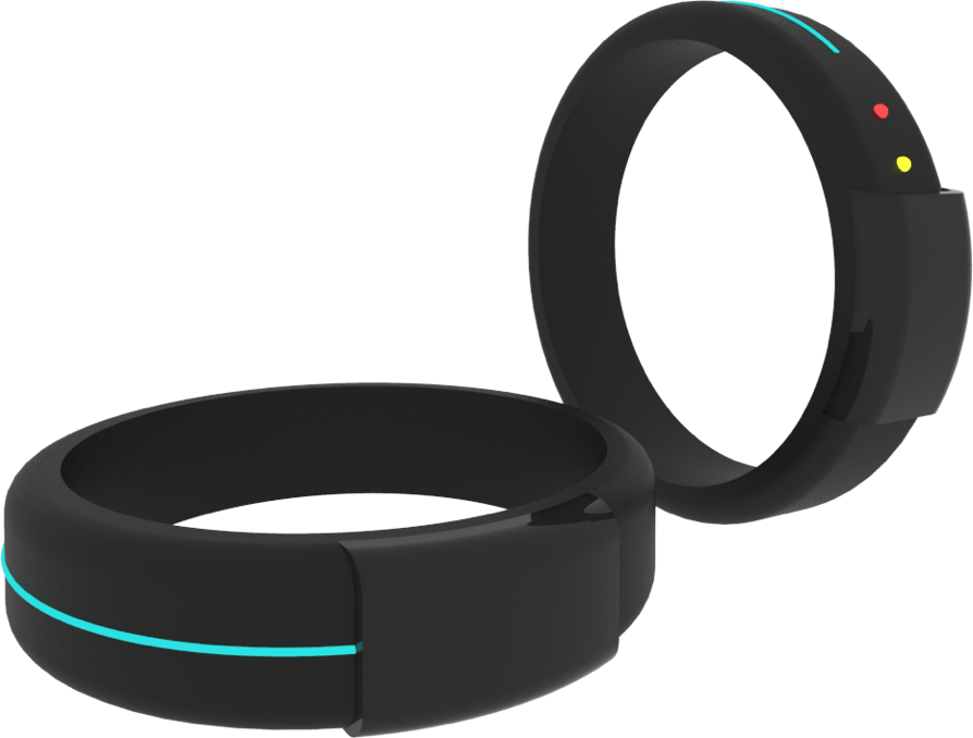
Final Design - Convoy+
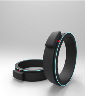
For iteration 2, we still decided for our wearable to be a ring, because it is small and discreet. The ring can be turned to activate alerts because users can perform this action quickly without others noticing. We made the blue band go all the way around the ring in Iteration 2 because in Iteration 1’s concept, users mentioned that the sliding component blocked their view of part of the blue light. Additionally, in iteration 2, we made only one code show up at a time, instead of displaying both the red and yellow codes to reduce confusion over which code was being activated. Users would have to turn the slider 90 degrees to activate the yellow code and the ring would flash a small yellow dot, and they would also have to turn the slider 180 degrees to activate the yellow code and the ring would flash a small red dot. We wanted to make the turning very intentional to reduce chances of accidentally activating the emergency codes.
Evaluative Research
Moderated User Testing
Objectives
Assess whether users can successfully complete critical tasks using our Convoy prototype.
Method Justification
Allowed our team to evaluate specific user flows of the prototype as they interact with the prototype. Also allowed us to consistently measure users performance and understand their overall feelings related to the prototype’s usability.
Method Details
* 3 participants (all Georgia Tech female graduate students)
* Used a Figma Prototype on an iPhone 8
Team Roles
* Sample Tasks
I phrased some tasks to cause users find information within the app and give an answer to test the prototype’s visibility of information. For example:
Other tasks simply involved users performing a series of steps. For example: Please show us how you would get walking directions to Midtown.
* Success Metrics
Procedure
* I obtained verbal consent from the participant.
* I asked participants to perform each benchmark task. Notetaker would record the success metrics for each task. We grouped benchmark tasks related to various scenarios/functionalities in the app (ex: we asked several tasks related to the neighborhood functionality and grouped them together in a scenario).
* After each scenario, I asked participants to verbally respond to our After Scenario Questionnaire (Likert Scale question formal, 1 = Strongly Disagree, 5 = Strongly Agree)
* After all the tasks and scenarios, I verbally asked participants to respond to the SUS (System Usability Survey), a 10 question form that provides a consistent measure of the overall usability of the system. Participants respond with a number between 1 to 5 (1 = strongly disagree, 5 = strongly agree).
Analysis
I compiled all the user’s performance metrics, After Scenario Questionairre, and SUS scores for each user in an Excel document. I found the averages for the performance metrics and ASQ scores and calculated the SUS scores accordingly. Based on research[1], a SUS score above a 68 would be considered above average and a 80.3 or higher is an A.
Moderated User Testing - Convoy+ Wearable Ring
Objectives
Assess whether users can successfully complete critical tasks using our Convoy+ prototype.
Method Justification
Our team was able to understand how visible our prototype’s affordances were, how natural the interactions felt to our users, and overall how comfortable and usable our wearable system was.
Method Details
* 2 participants (all Georgia Tech female graduate students)
* Uaed a 3D printed model of a ring
Team Roles
* Sample Tasks
With these tasks, we asked partipants to perform a certain gesture/interaction with the wearable in response to some information we provided them. For example: Please activate the red code on the ring.
* Success Metrics
Procedure
* Facilitator obtained verbal consent from the participant.
* Facilitator obtained verbal consent from the participant
* Faciliator provdided a brief tutorial of the wearable ring’s functionality. Facilitator then read each task and notetakers recorded participant’s reactions and other observations.
* After all the tasks, the faciliator asked participants a modified After Scenario Questionairre. Participants rated how much they agreed with the statements on a 1 to 5 scale (1 = Strongly Disagree, 5 = Strongly Agree)
Sample Questions:
Analysis
I compiled the After Scenario Questionairre scores for each user in an Excel document to find the averages. Additionally, I stepped through the qualitative observation data to determine design implications and improvements.
Findings - Design Improvements for Convoy
1: Added a Wearable Device Tutorial to the Tutorial Screens
Our users were not clear on how to use the wearable during the testing session. By adding a few tutorial screens in the onbaording section, we believed that this would help our users understand how they could use the wearable if they decided to use it.The tutorials would include animation or videos to demonstrate the gestures and other interactions needed to operate the ring,
2. Added Detailed Information to the News Stories
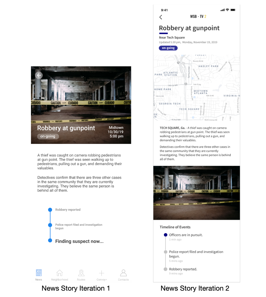
Users stated that if they were new to the app, they would not trust the stories within the app without knowing the origin of the news stories. We added the source of the news story at the top of the page. Users also wanted to know more information about the timing of each update and the location of this event in the event timeline. Hence, we added a map of the area and timestamps to the timeline of events to tell show users when the story was last updated.
3. Changed the Neighborhood rating system
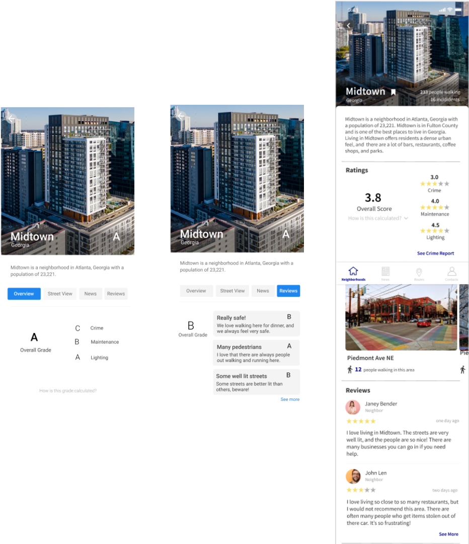
Users were not sure what the letter ratings represented on the original overall page for Midtown. We decided to move to a rating scale that showed numbers and stars. We did this because our users stated that they would prefer to see numbers. We added the stars because we believe that the visual representation of ratings would also be helpful to users.
4. Changed the Routes section
Users stated that they did not understand what the Bluetooth symbol in iteration 1 of the route meant, so we changed the wording to explicity say Convoy+. This change will help users understand how exactly to send their route to the wearable. The map in iteration 1 seemed to be unclear and hard to read for our users, so we replaced the map with a detailed view that would be easier for users to read. Finally, because we switched the ratings to a numerical scale out of 5, we also changed the ratings here in the routes section of the app to show the same numerical ratings out of 5. We wanted to keep ratings on these pages so users could understand how safe each route option was.
Findings - Design Improvements for Convoy+
1. Make the codes harder to activate
Users thought that the turning motion needed to activate the yellow and red codes of the wearable was very easy. They did not want to accidentally activate the codes if they happened to be fidgeting with the ring. Our change is that users turn the ring 90 degrees once and then hold it there until they feel a click and see visual feedback that the yellow code on the ring had been activated. Users would turn the ring 180 degrees once and then hold it there until they feel haptic feedback and see visual feedback that red code on the ring had been activated. We do not want the codes to be accidentally activated, because this was an issue with other safety wearable devices that we have researched.
Future Work
We received a lot of amazing feedback on our solution at the end of the semester. With more time, these are the areas I’d love to explore to improve Convoy and Convoy+
1. Add triggers to activate voice commands in Convoy+
Users thought the speech part of using the wearable seemed very familiar to voice assistants like Alexa. However, users wanted a voice trigger instead of having to tap the ring. We would implement a voice trigger such as “Hey Convoy+” to then activate the voice commands for users. We would make this change because if users were, for some reason, unable to touch their ring, they would still be able to alert friends, family, or law enforcement very quickly.
2. Reduce the length of the Onboarding Process
When walking through the onboarding in our user tests, our users pointed out that the onboarding process was very long. They said that they would skip this process if they were to download the app. Since this app includes new functions that users are unfamiliar with, many of the tutorial and onboarding screens are important to help users know what the app is, what the wearable is, and how they interact with both. We realize that many of the steps in the tutorial and onboarding could be integrated within the app.
3. Layer Information differently within the crime reports feature
Users commented that they felt there was too much data given to them on the crime reports page of the app. Users only wanted to see high-level information first, and they wanted options to view more detailed information if they truly wanted it. The change we would make here would be to layer the more detailed information on a page after the map and weekly summary given to users on the overall crime page. The annual and yearly crimes would be moved off of the main overall crime page. Users would see summaries of overall crime information for the week, and then they would click “see more” to see more detailed information and graphs about crime throughout the month, year, or twenty years. We believe that this change would help reduce the cognitive load for our users. It would also be easier for them to get the quick live and weekly information that they wanted, while also being given a choice to find out more detailed information about crime.
4. Test with non-Georgia Tech individuals (a more diverse user group)


Made with GatsbyJS and Bulma by Anjali Devakumar in 2019