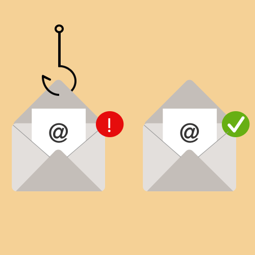
Avoiding Deceptive Phishing
Assisting people in avoiding and learning how to spot email phishing scams.
Undergraduate Honors Thesis
Overview
Problem
Deceptive phishing refers to an attack by which hackers mimic a legitimate company and attempt to steal a customer's credentials. This attack commonly occurs over email and websites to create a false representation of legitimacy for unassuming users. The average person does not actively think about security as they check email, browse websites, and complete tasks online. By using convincing visuals and emotionally-charged language, the content of phishing emails hinder critical thinking to compel one to respond to the email’s request and divulge their personal information. The impact of deceptive phishing is tremendous, resulting in identity theft for individual users or data breaches for influentual companies.
Solution
I created a redesigned email interface that aids users in determining whether a redirected hyperlink in an email is malicious or legitimate. The interface focuses on providing simple error messages that do not overpower the email content, enabling users to complete their tasks efficientiy while also being informed of security.
Details
Process
1. Research
Literature Review
Design Implications and Goals
""
2. Design
Informed Brainstorming
Wireframes
High-Fidelity Prototype
3. Evaluation
Usability Experiment
Poster Session
Thesis Defense
Research
Literature Review
High-Level Goals
-Identify which demographic groups may be more at risk for falling for phishing attacks
-Uncover physiological and psychological impact of phishing
-Map out existing solutions within research, employee training, and general user awareness
-Evaluate design suggestions for security, as well as any proposed algorithms or proposed solutions for email security specifically
Problem Impact
Phishing, a pervasive security scam, is an umbrella term that describes fraudulent practices by which an attacker attempts to steal personal or sensitive data by posing as a trustworthy source. Because it can compromise private data, phishing scams pose significant threats to individuals and companies.
By the numbers,
Further research into the problem space demonstrates that people may lack a fundamental understanding of how a phishing email looks and how to respond if they receive one. Improved security awareness for all demographic groups is needed to reduce the effectiveness of phishing attacks.
Psychological Influence
While I conducted my literature review, I read papers and books related to theoretical cognitive psychology, as phishing is primarily an attack that takes advantage of human behavior to manipulate their actions accordingly.
There are three dimensions of a successful phishing attack:
- 1. Insufficient knowledge - Users lack awareness of computer systems or security indicators
- 2. Visual tricks - Visually distorted text, images used to hide actual text, deceitfully crafted websites
- 3. Inadequate attention - The absence of attention to security indicators and lack of awareness towards missing security indicators
Cognitive psychology, the study of mental processes such as attention, perception, and problem-solving provides insight into how users make decisions, prioritize information, or learn skills. As humans primarily engage with visual information on a screen to make decisions quickly, having this solid background can allow me to create a redesigned interface more in line with a user’s typical behavior.
A Few Existing Solutions
Existing security warnings use reactive methods that notify the user after they click on a link.
Gmail
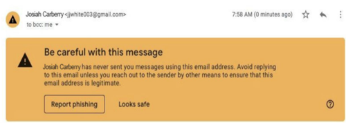
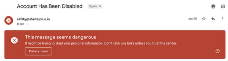
Gmail places an unknown sender warning above the email body if a user receives an email from an unfamiliar sender. When suspected phishing or spam is detected, Gmail also allows users to report emails for phishing and flashes a generic warning that alerts users that an email is dangerous. The bold red color, while attracting attention, can intimidate users and detract from the email content if the email is genuinely legitimate.
Inky
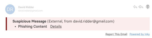
Inky is a security technology company that features add-ons to Gmail and Microsoft email platforms. Like Gmail, it can warn users in the event of a malicious email, but the warning messages are often vaguer and smaller.
| Pros | Cons | |
|---|---|---|
| Blacklists & Whitelists | Clear way of categorizing links | -Sometimes constrained by needing exact matches -Not useful against zero-day attacks |
| Heuristic Solutions (Set of rules) | -More robust in not requiring exact URL matches -Produces less false positives | Ineffective against zero-day attacks |
| Training/Awareness | Thorough and can provide responses for different scenarios | People may not remember the training under the conditions of an actual attack |
As shown by the existing solution space, reactive indicators that warn the user before clicking on a link do exist in practice. Users can benefit from a solution that informs them of the conseqences before they click. My solution shifts to being a proactive indication that addresses this pain point.
Understanding User Abilities
When using a web or mobile interface, humans rely on their vision to form judgments, process information and allocate attention to objects. Therefore, I read Cognitive Psychology literature to identify any principles that are relevant to explaining how users interact with a web interface and how to redesign the email interface to draw attention towards phishing warning messages.
| Cognitive Psych Principle | Design Implication |
|---|---|
| Goal-oriented navigation: People tend only to notice options that match or lead them towards their primary goal | -Provide multiple yet distinct choices rather than leaving users to complete their end goal open-endedly. -The warnings should convey potential consequences of risk to the user along with possible recommendations so they can complete their tasks. |
| Screen center bias: People tend to look at the center of a screen before moving on to other parts. | The location of the alert is critical, and warning designers should place alerts where the user is focusing. |
| Color, motion, orientation, size are the most useful guiding attributes for visual search | The design should present text and graphical based warnings and information that are a high contrast from the email system. |
| People tend to scan for pertinent information on a web page to find information of interest quickly | -Warnings should balance initial details about the risk because users will not read wordy details, but too-condensed information can be vague and confusing. -Messages must minimize jargon and technical words in the warning messages to avoid intimidating users. |
Design
Design Goals
Using the information obtained from the literature review, I identified the following goals for my proposed design:

Strike a balance between the email system and a human user’s ability to identify a malicious email

Design will guide users with distinct choices to complete their task, but user is in control

Increased focus on providing relevant information and understandable language (no technical jargon)

Potential consequences and recommendations should be conveyed
Design Flowchart
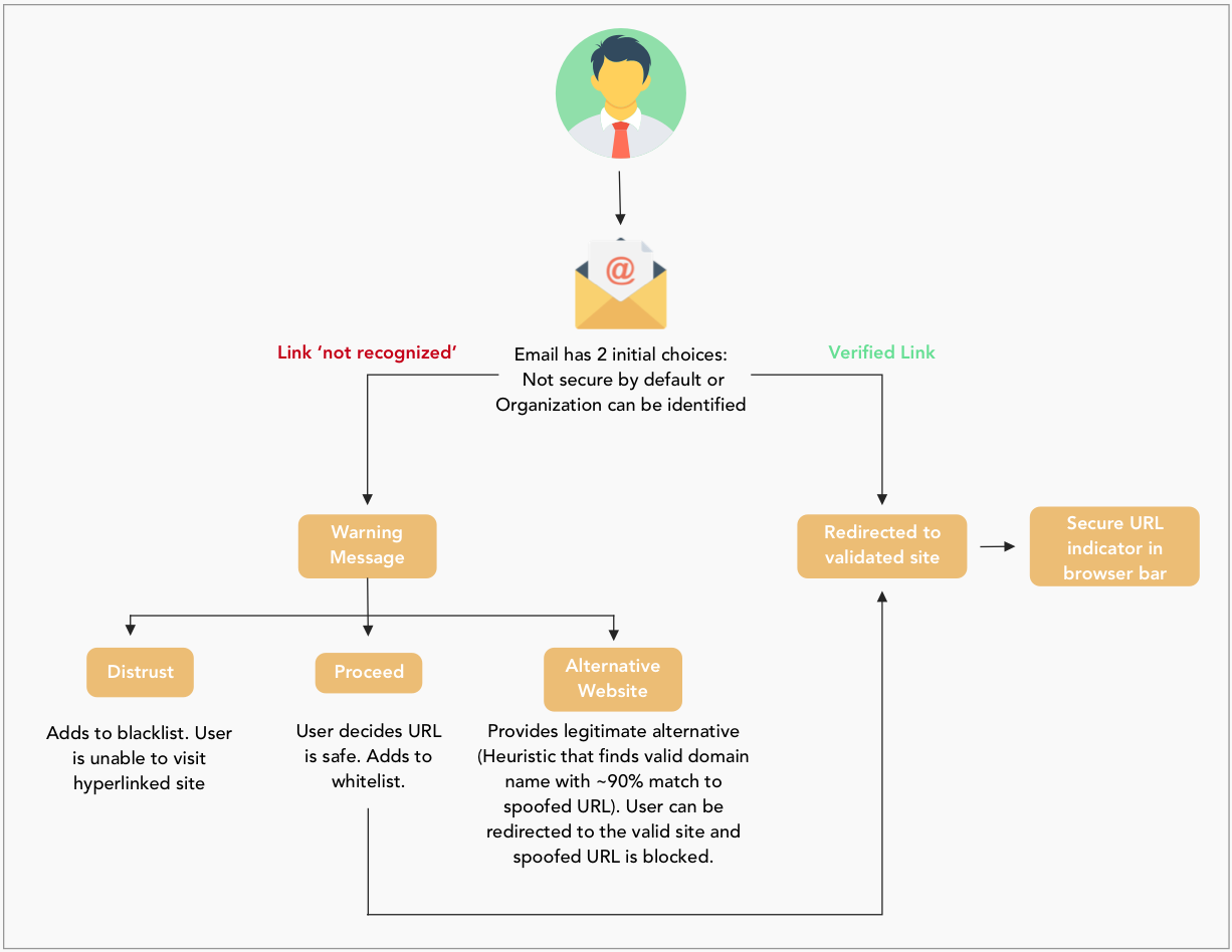
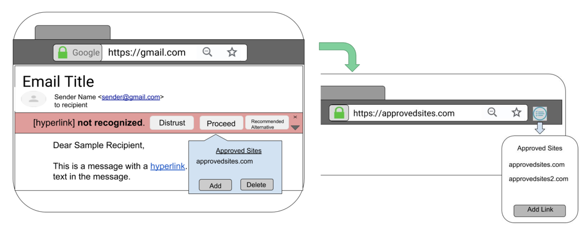
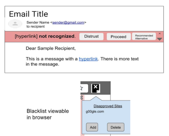
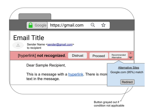
A link is recognizable if it belongs to a significant organization or if the user has previously trusted it. Once a user trusts a link, they will never receive a warning message for an email with that specific link. The warning message will not pop up excessively and cause the user to ignore it. If the link is not recognized, the email presents a generic warning message above the email body. Upon reviewing the links, a user can distrust the link by blocking it or proceed to the website by trusting it. Since the focus is on deceptive phishing links, there is a particular recommended case that checks to see if the fake link matches a legitimate domain (90% or higher match). If the email system can identify a valid alternative, it displays it and redirects the user to the correct website. Although not included in this concept, the design assumes a personal black and whitelist concept that contains links the user has personally blocked and trusted. The design employs these personal lists in the case a user accidentally blocks or trusts a website and needs to make changes.
Low Fidelity Prototype
Based on my design flowchart and suggestions from the literature review, I created rough prototypes using Powerpoint. I focused on making the design choices as simple as possible.
Proceed Case
Distrust Case
Alternative Case
After presenting these concepts to a few people, I received feedback indicating that my error messages were not informative enough. A few people were unsure what actions would occur after they clicked on a certain button, because the button wording did not fully convey that. Additionally, a few people thought red was not the best color choice. However, people liked the discrete and distinct options and additionally liked that the messages did not fully detract from the email body content. In my next iteration, I focused on crafting more informative error messages and providing recommendations for what users should click.
High-Fidelity Design
For the high-fidelity design, I identified seven major companies and designed phishing emails by referencing their style guide. The organizations are: Bank of America, Spotify, Dropbox, LinkedIn, Google Drive, Netflix, and Amazon. Below is the Spotify email I created.
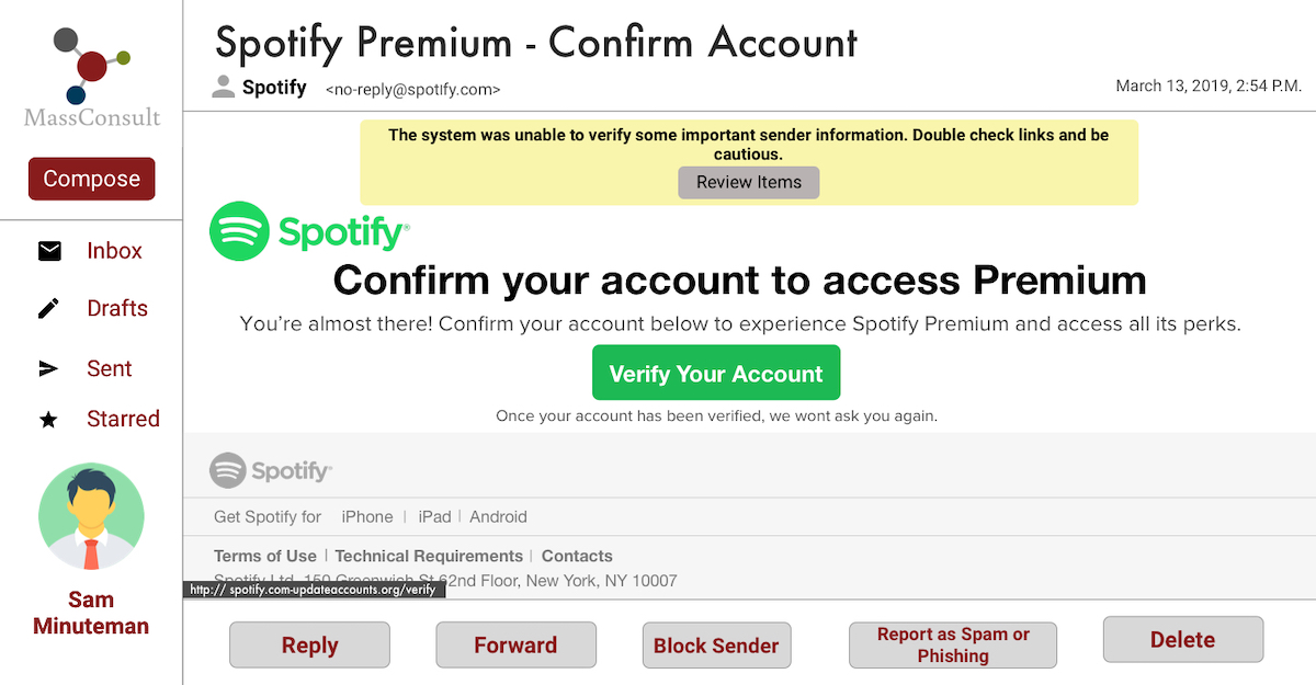
Screen 1: Review
● Paler yellow color primes users for caution, rather than instilling fear or panic with a brighter/threatening color such as red that could cause them to act irrationally
● Generic message describes the reason why the email system placed a warning without any technical jargon to allow them to pay attention to the warning
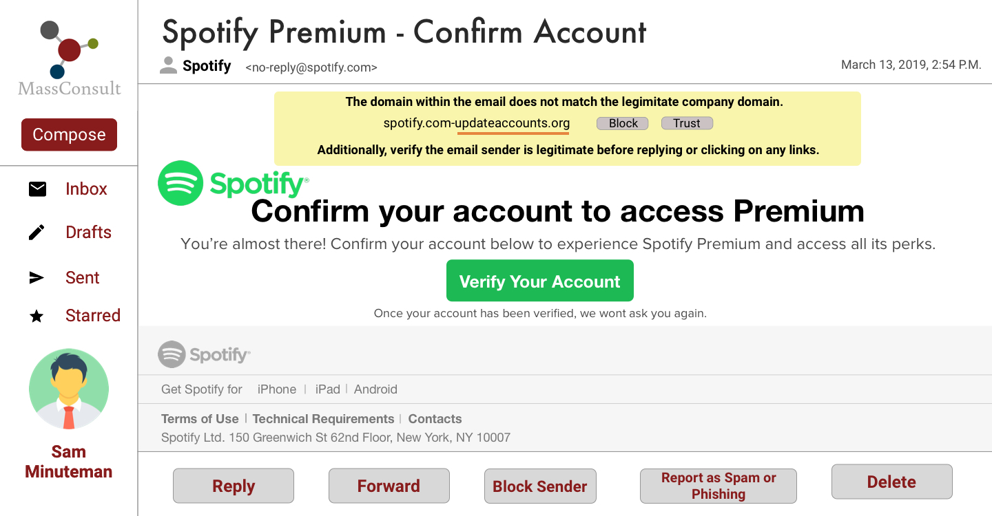
Screen 1: Review
● Suspicious area of URL is underlined in red to stand out against the yellow background to encourage the user to inspect the link closely.
● The warning offers two discrete choices but does not highlight one option because the system leaves the decision to trust the email link up to the user.
Evaluation
Usability Experiment
Through an unmoderated usability test, I evaluated how effective my email interface design was in communicating relevant information about the email. I created 7 different emails for the experiment using Sketch- 5 emails contained a deceptive phishing link and 2 contained no deceptive links. I framed the usability test as a role-playing activity where participants would assume the role of a character, Sam Minuteman, who works at a fictional consulting company and is evaluating a new email interface based on usability principles.
I had a total of 30 participants engage in my study. I randomly divided participants into two groups: Design Interventions (redesigned emails) and No Design Interventions (standard emails). I was not in the same room as them while they engaged with the experiment because I wanted to emulate a scenario in which someone was checking their emails alone, and I also did not want my presence to bias their decision in any way.
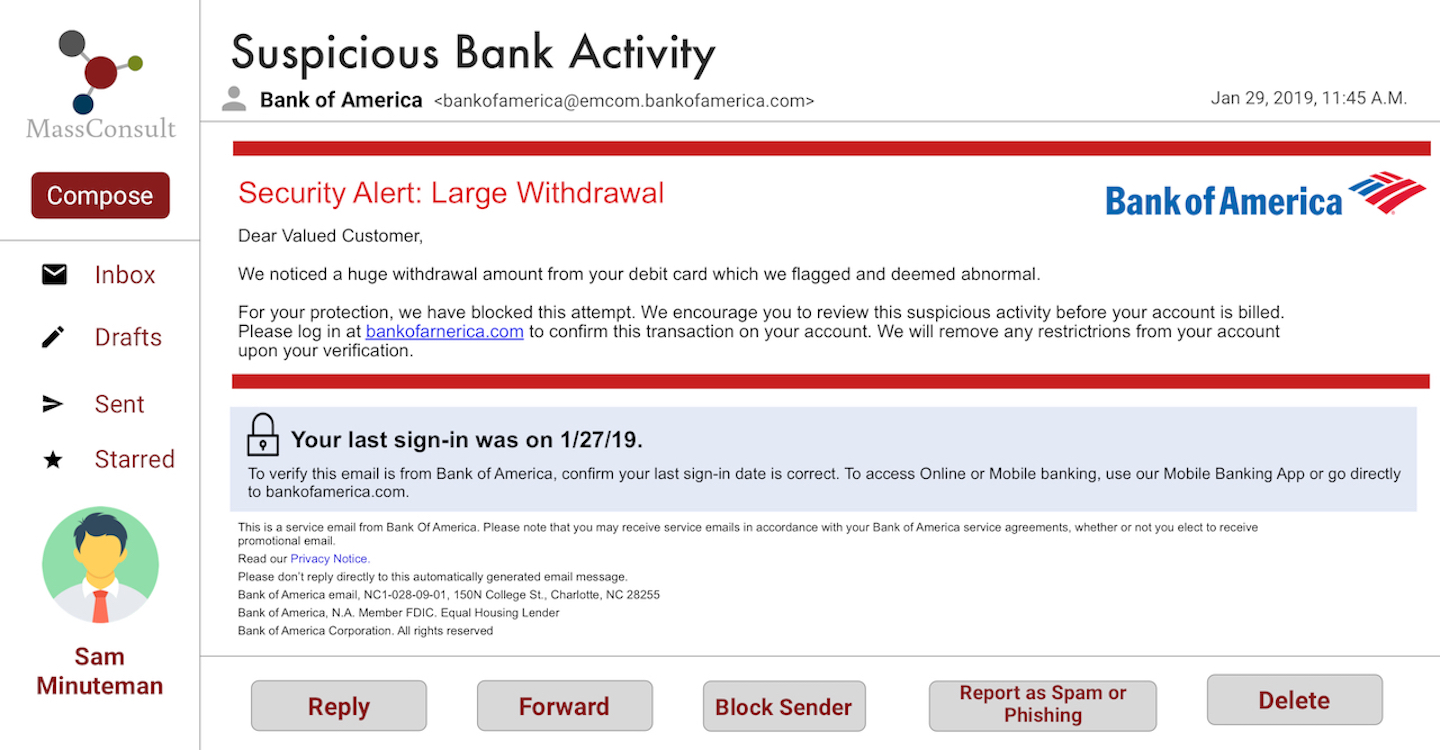
Bank of America email: No Design Interventions
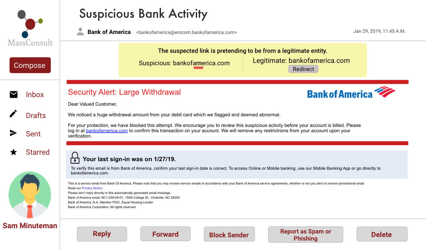
Bank of America email: Design Interventions
Measuring Success
During the usability experiment, I tasked participants with reading the email content and choosing how they would respond to the email. They could use the 5 buttons at the foot of the email, click on buttons/links they found in the email - I was intentionally vague in telling them where they could click because I did not want influence their actions. These are the following metrics I used to evaluate how effective participants were in not getting phished:
Quantitative - Performance
Task Completion : I capped each trial at a minute to ensure participants were browsing emails at a pace that mirrored real email browsing behavior. If participants spend more than a minute looking at an email, the trial immediately ends and moves onto the next one, and the trial outcome is “timeout”.
Phishing Amount:In a trial that contains a malicious email, I defined clicking on any of the hyperlinks, ‘Reply,’ or ‘Forward’ as being “susceptible to a phishing email. Regardless of where someone clicks in a legitimate trial, they will be safe, so I say they pass that trial. For each trial, I determine if a participant passes or gets phished
I assigned the following values to each of the various trial outcomes:
I added up the results for each participant and compute their average performance. Getting a score of 0 means that the user got phished for every email and a score of 1 means they passed every email.
Quantitative - Self-Report
I also conducted a post-experiment survey to ask participants to rate aspects of the email design interface and how comfortable they felt using the tool. I created 9 Likert Scale questions that gave me a quantitative measure of usability:
1. Relevant information is easy to find
2. Email content is clearly presented
3. Action buttons provide clear choices
4. Colors and fonts are aesthetically pleasing
5. I am able to identify any messages and choices easily
6. I find the messages and choices presented easy to follow
7. The interface is easy to learn and use
8. I felt confident using the interface
9. I would recommend this interface to a friend
Qualitative - Self-Report
When I debriefed participants about the usability test’s true intentions, I held an unstructured interview with them where I showed them their results (how many times they were phished). This method gave me qualitative data regarding participants overall thoughts and impressons of the design, and additionally they provided me verbal feedback and talked about their experience with phishing.
Experiment Results
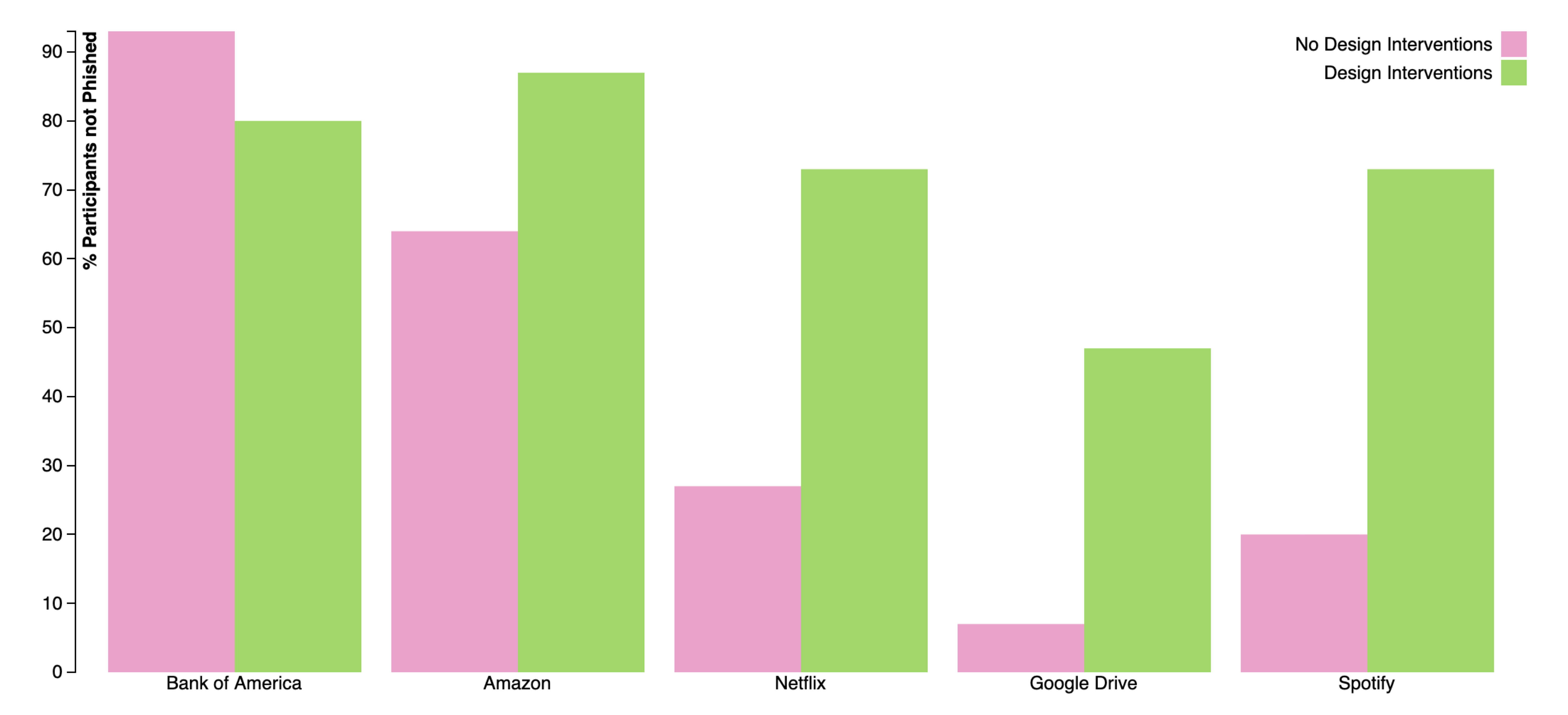
This bar chart shows phishing susceptibility on each malicious email trial. The height of the bar indicates the percentage of participants who did not fall for phishing on that specific email. Email phishing susceptibility increases from left to right, with Bank of America being the easiest to spot and Spotify being the hardest to spot.
Interpretation : 93% of users in the 'No Design Interventions' group did not fall for the Bank of America email
Overall Averages (15 participants in each group):
No Design Interventions : Users passed 57.6% of the emails*
*One participant timed out and did not respond (so calculated using 14 participants)
Design Interventions: Users passed 80.6% of the emails
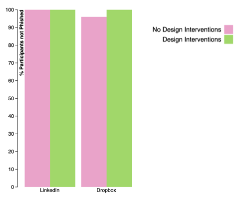
The second bar chart describes phishing susceptibility on each legitimate email trial. The height of the bar indicates the percentage of participants who did not fall for phishing on that specific email. In legitimate email trials, regardless of whatever option chosen, participants will not get phished.
Post Experiment Survey Results
Design Intervention Group - Response Breakdown
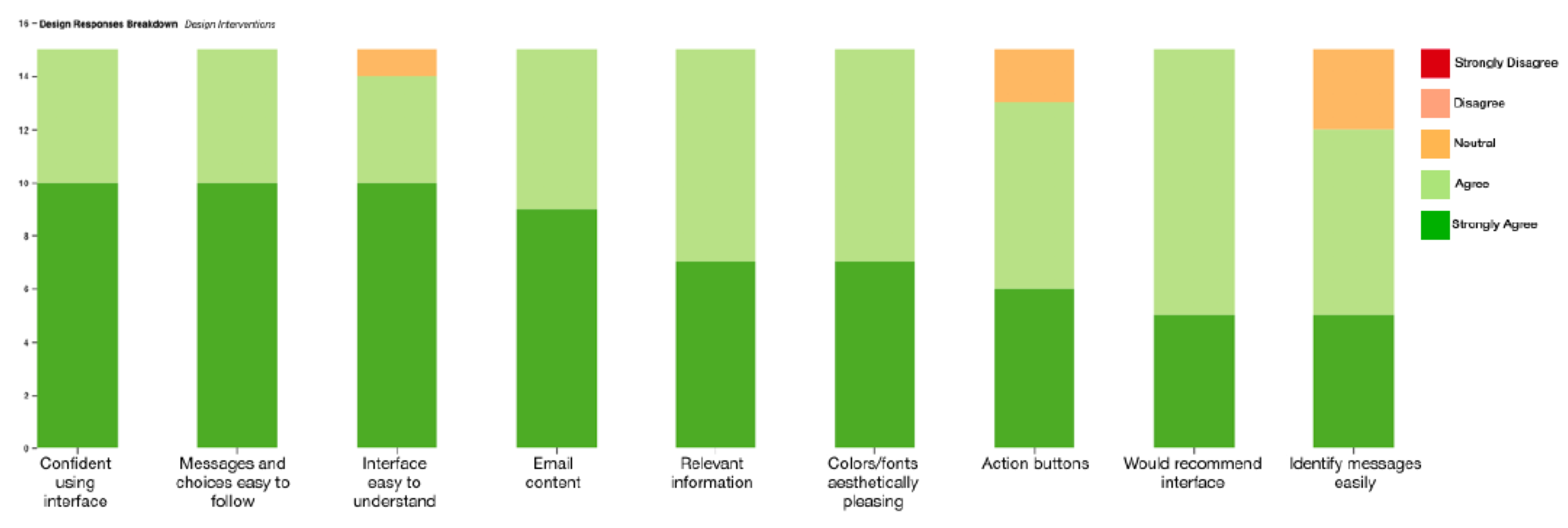
This stacked bar chart shows the Design Intervention group’s breakdown of responses for the 9 Usability/design critique questions I asked after the usability experiment. Each bar represents a design statement and the bars are in order of more positive agreement to each of these statements.
No Design Intervention Group - Response Breakdown
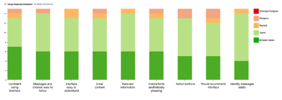
This stacked bar chart shows the No Design Intervention group’s breakdown of responses for the design critiques. Each bar represents a design statement and the bars are in order of more positive agreement to each of these statements.
Design Feedback and Suggested Improvements
Overall, subjects in the Design Interventions group gave much higher ratings for all the presented statements, as the lowest rating any participant gave was ‘Neutral.’ However, a few design issues became apparent after this evaluation session.
Issue 1: Yellow color chosen for the warning might not be captivating enough
The next iteration of the warning design can have a brighter version of yellow or orange to catch the user’s attention. The security indicator could feature an icon in red, and the yellow box can include some 3D shade or border to increase the contrast of the warning and make it noticeable alongside the email content.
Issue 2: Some users wanted to ignore the email within the experiment/Some did not want to click ‘Review Links”
The next iteration can provide users with the ability to not take any action at all. However, one goal of the design was to educate users about how deceptive phishing looks, so more thought should be placed in teaching users these signs while also minimizing the effort they need to spend interacting with the email.
Issue 3: Some users expressed confusion about the legitimacy of the system’s messages.
To legitimize the warnings, the next version could include a statement saying that the messages are coming from the email system, so participants do not think it is part of the malicious email.
Reflections and Future Work
Overall, the participants believed that the redesigns strike a good balance of not only giving the user control on determining the legitimacy of a link but also priming them with unambiguous email system interventions. The usability experiment sheds insight on how people browse emails, and the biggest takeaway is that people do not spend time reading the email content in detail. Overall, the redesign demonstrated that some mediation on the email system’s behalf alerts users about suspicious security activity and decreases the number of phishing attacks.
The next steps of this research would be to incorporate the participant feedback and create a second version of the redesign for further user-testing. I want to extend my participant pool to non-UMass students to see how demographics such as age and work experience can affect phishing prevalence. Since people routinely check email on their mobile devices, I would like to explore how to design security indicators for different types of interfaces like email applications and emails viewable on a mobile browser. Exploring these various mediums can demonstrate what design elements and psychological phenomena are universally applicable, and what varies based on the interface.


Made with GatsbyJS and Bulma by Anjali Devakumar in 2019