Findings
We found 3 main accessibility issues with the kiosk:
1. Lack of Customization.
2. Lack of Feedback.
3. Low Contrast.
Problem Focus
In the year 2050, the amount of individuals with visual impairments is expected to double to more than 8 million.
NCR is one of the largest kiosk providers, selling self-service kiosks, ATM machines, and more in 180+ countries. The current self-service NCR kiosks need an upgrade to the accessibility features for users that are visually impaired. While NCR’s kiosks contain several accessibility features for visually impaired users, there is still more progress to be made in this area. In a semester-long collaboration, my team created a self-checkout grocery store kiosk concept that addresses visually-impaired user pain points and aligns with NCR’s business goals.
Solution
1. A mobile app that pairs with a self-checkout kiosk to help visually-impaired individuals efficiently scan, checkout, and pay for their items.
The app additionally helps such individuals locate grocery items in the store using an interactive store map, display product information using AR technology, and transfer their accessibility settings preferences to the kiosk screen.
2. A refreshed kiosk interface in line with current accessibility standards.
Contribution
As the lead UX researcher, I designed and created our interview protocol and survey, planned our research timeline, recruited participants and conducted interviews, and led expert and usability testing. I additionally aided in the creation of concept sketches and wireframes for our divergent design phase, and I designed any voice assistant technology in the prototype.
I served as the project leader for the end of our design phase in this time I defined the meeting agendas, prioritized tasks by identifying team strengths and supported team members, led discussions, and served as a point of contact for our NCR stakeholders.
The Team
Research Process
Guiding Questions
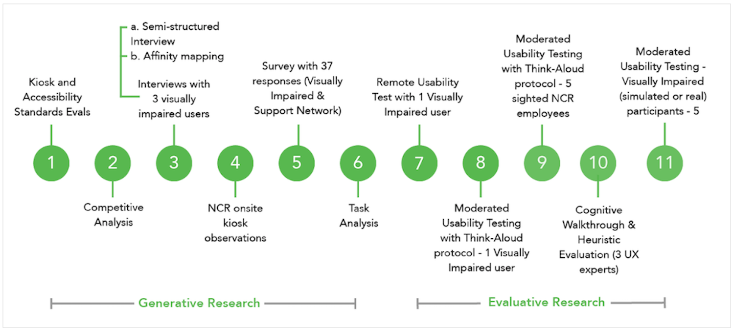
To understand visually impaired users better we conducted multiple research activities. A few questions that we wanted to answer with our activities:
1. How does NCR's current kiosk system work?
2. How do our target audience utilize assistive technologies? Is there a common preference for a feature?
3. How do our users use current self-checkout kiosks? What are their challenges and what goes well?
Accessibility Evaluation/Observations
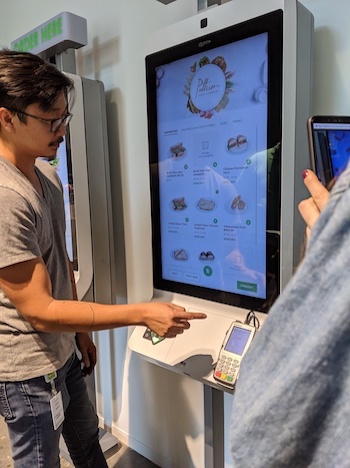
After familiarizing ourselves with web and kiosk accessibility guidelines, our team started by observing NCR's kiosks in use to identify the existing accessibility features, pain points, and opportunities for improvement.
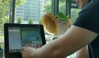
Top: Sighted participant using the self-checkout kiosk in NCR's grocery store.
Bottom: Sighted participant doing a think aloud in front of a standing kiosk used to order food at NCR's restaurant.
Competitive Analysis
We wanted to understand what accessibility feature were already available to users in self-service kiosks that were made by competitors (Diebold Nixford, Posiflex, Toshiba, Emboss). We looked at ADA Compliance, support for Assistive Technology products, customizability of the kiosk screen, and ease of use.
Semi-structured Interview (n = 3)
"The kiosks aren't really something I use. I get frustrated, because sometimes the voice works and sometimes it doesn't. I'd love to be able to use it one day though."
User 1 - Fully Blind
Since we are still in the early stages of our research, interviewing visually-impaired users would help us get insights into how they used assistive and regular technology, shopped for groceries, and if or how they receive assistance for technology. We interviewed 3 legally blind participants and observed one of them using their assistive technology .
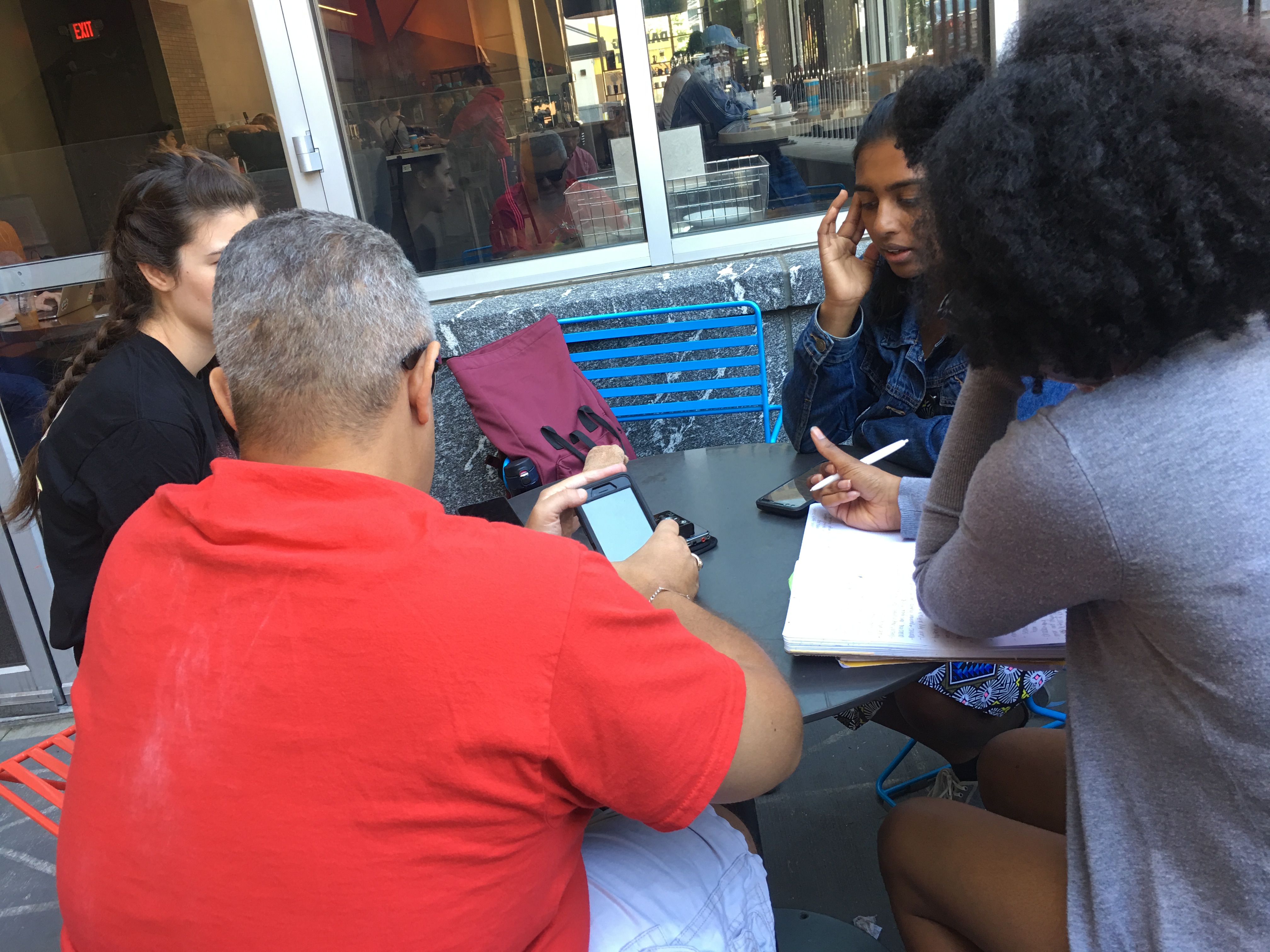
Our team conducting an interview with a blind user. I served as the interview moderator and my teammates took notes/artifacts.
Survey: Visually-Impaired People and Support Network (n = 37)
I designed and deployed a survey using Qualtrics because of its high accessibility to visually impaired users and their support network. The survey helped us reach a wider audience and supplement the qualitative data we obtained from interviews, competitor analysis, and observations.
We wanted to find out users' likes and dislikes in regards to self-service kiosks in grocery stores, their preferences in regards to assistive technologies, and we also wanted to understand how people who work with blind individuals or family members of people with visual impairments may help them.
Synthesis: Affinity Mapping
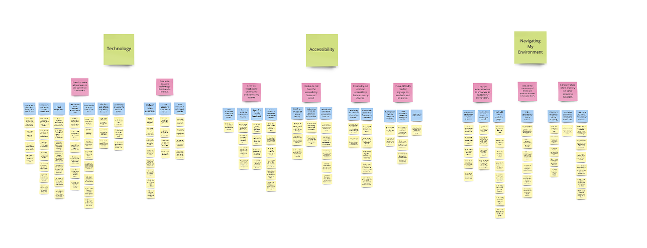
Generating insights together was a very rewarding yet perplexing part of our research process. We sifted through the insights from our generative research as a team and organized them in an affinity map. This helped us identify the top pain points our users encountered and create design implications for our design.
Top Pain Points
From the research conducted, we prioritzed several challenges our target audience had using a self-service kiosk. Below are the major pain points experienced by the users that were prioritized for the first iterations. Priority was chosen based on common themes expressed through generative research and feedback from users.
1. Screen reader audio is not enough to help in navigating the kiosk
2. Limited feedback does not guide users on actions to perform
3. Frustrating error-recovery process, often requires external assistance
4. Text size and color contrast not optimized for visually impaired functioning
5. Kiosk accessibility features not consistent or familiar with existing accessibility conventions
Design Implications
From the pain points, as a team we brainstormed several top needs our design would address to focus our efforts and ensure our design would address these pain points.
Customize the visual elements of the kiosk interface
Leverage existing technologies visually impaired individuals utilize
Incorporate Universal Design Principles
Ensure users remain in control of actions
Provide various feedback modalities - auditory, visual, etc.
Brainstorming
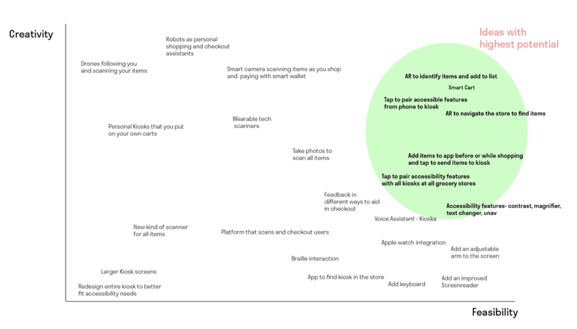
After our initial research activities, we conducted an informed brainstorming session as a team using the pain points and design implications we identified. We timed ourselves and generated ideas freely on sticky notes, and organized the ideas in a Creativity vs. Feasibility matrix to prioritze ideas that were both creative yet realistic in our timeline.
Design Ideation and Feedback
After considering the feasibility and creativity of each idea, we narrowed our ideas down to three different potential solutions that could solve our research problem. As we designed the features, we made sure to refer back to our research questions and implications to make sure the design focused on user needs.
To evaluate our design directions, we created wireframes and I moderated a usability test with two legally blind users. We identified sample tasks for them to perform with each wireframe and asked them follow-up questions about their experience.

Below are the three design ideas as well as some feedback we received from our users.
Idea 1: Customizable Kiosk App - Accessibility Focus
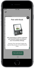
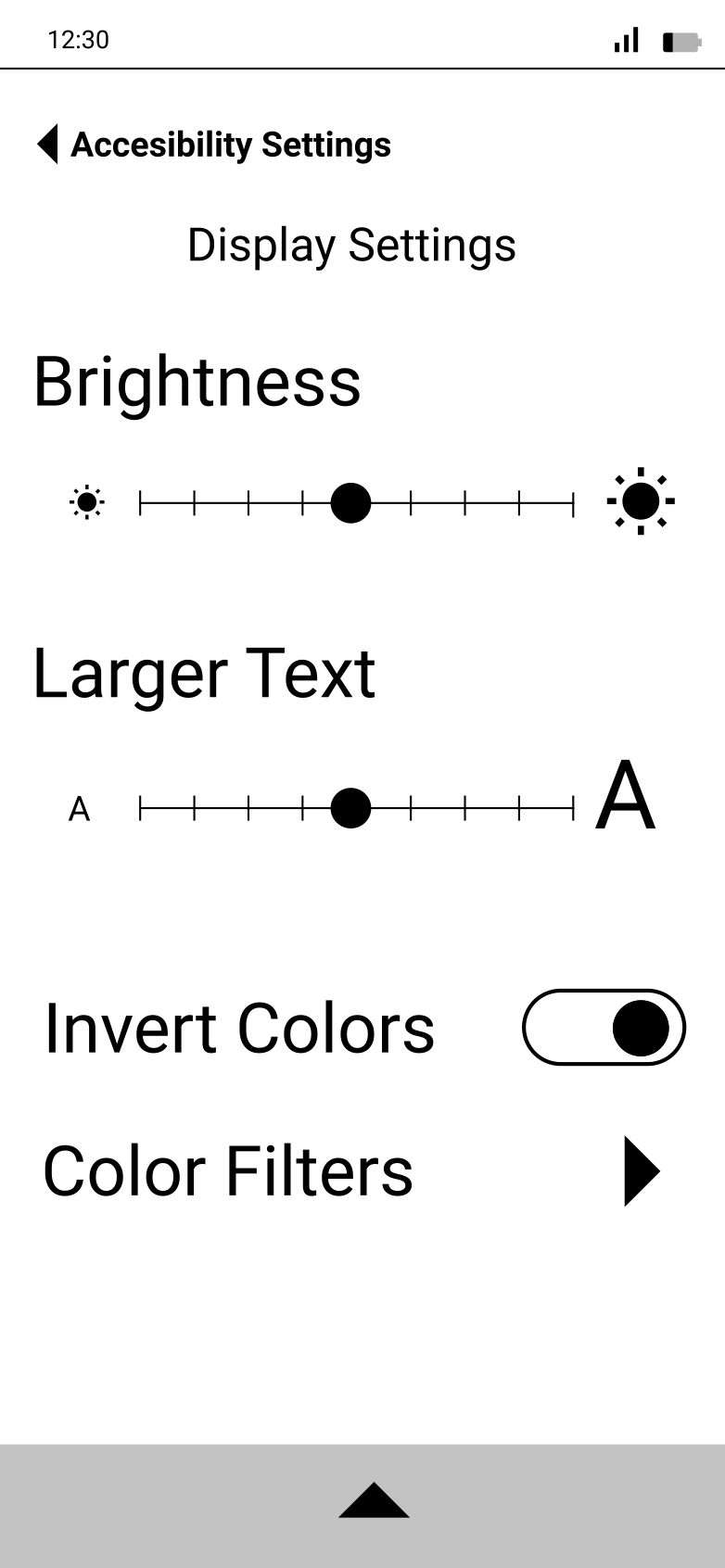
A user can tap to pair their phone with the kiosk. They can customize the kiosk according to their phone’s preferred accessibility settings, as well as keep track of items by viewing receipts of their past purchases.
Likes: Users thought tapping their phone to the self-checkout kiosk was an easy interaction, and the ability to leverage and apply existing accessibility settings was natural .
Dislikes: They expressed confusion on navigating through the app and found the receipt feature difficult to understand .
Idea 2: AR Store Navigation - Navigate and Identify Items
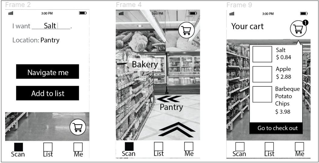
This design idea involved using augmented reality to help users identify store signage and items. It also allows users to scan aisles and sections within aisles in order to identify any needed products and them to their cart.
Likes: Users loved the ability to hear product information using AR, and they found discovering adding items this way was an easy process .
Dislikes: They expressed concern about the safety of this scenario if they were holding this application while walking around.
Idea 3: Smart Cart
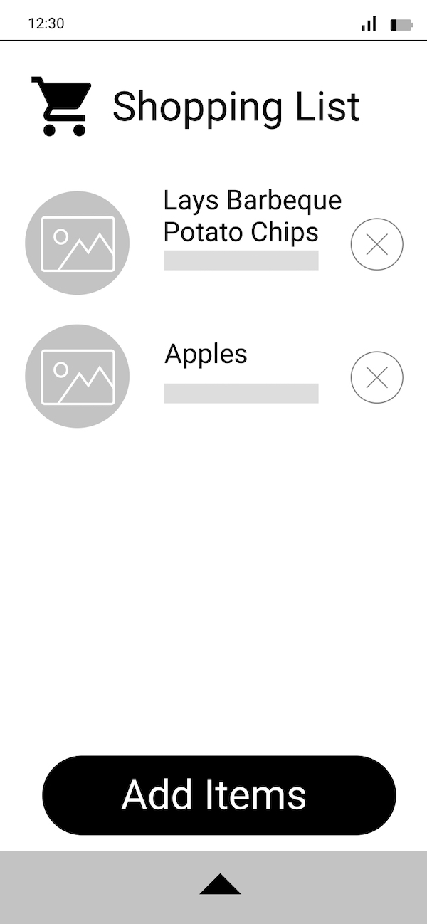
This design idea involved using a physical sensor attached to grocery cart that would identify items in your grocery cart. This idea also had an interface that users could use to add items in their cart or upload a digital shopping list that would send to the kiosk.
Likes: The ability of the smart grocery cart to read items aloud and instantly add them to the user's virtual shopping cart on the kiosk was helpful to them.
Dislikes: Users thought this was a time-consuming process . They thought it was tedious to have to put items in their cart to hear the audio feedback needed to identify the item .
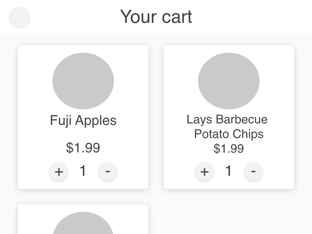
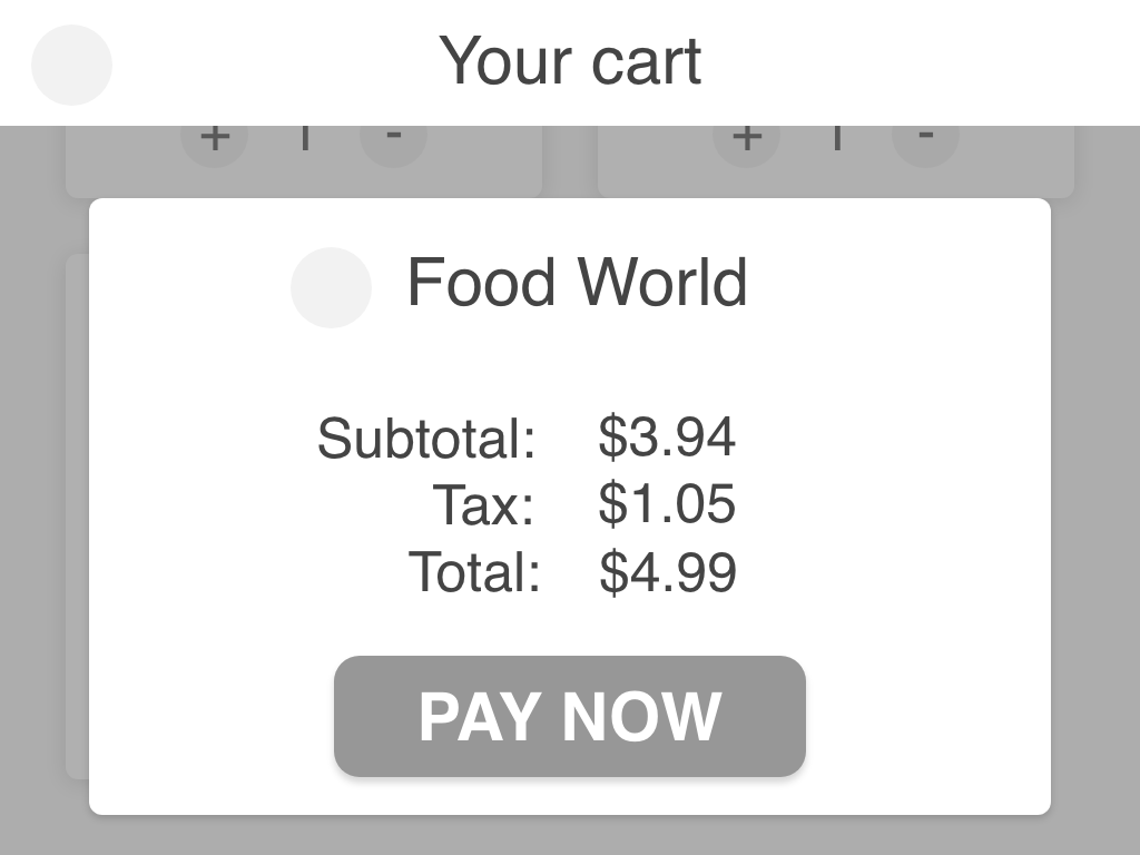
Final Solution
We considered the feedback we received from our testing session and decided on an idea that would integrate elements from each divergent design.
We primarily went with Design 1: Tap to Change Accessibility to allow users to customize and pair their accessibility settings to the NCR kiosk, as we felt it best addressed the underlying accessibility issues with the original kiosk.
The other features include:
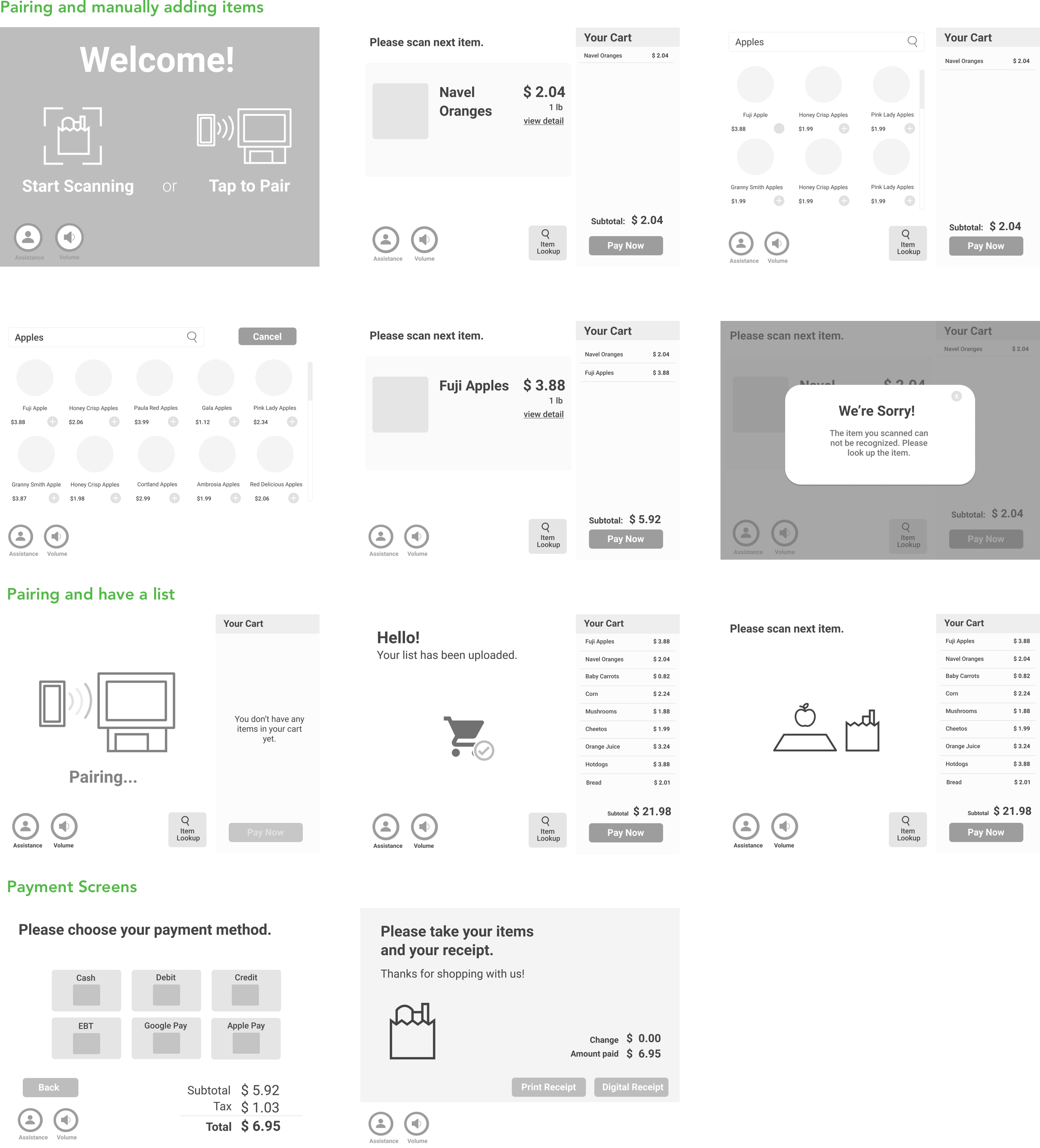
Low-Fidelity - Kiosk
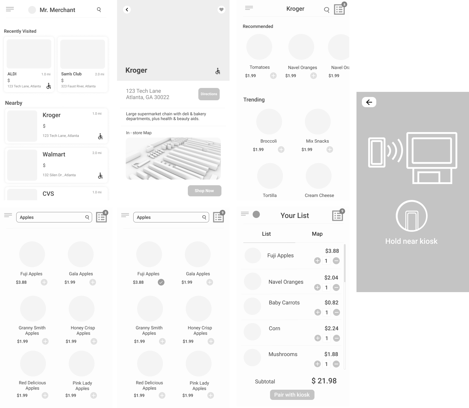
Low Fidelity - Phone Screens
User Testing - Low Fidelity
For the low-fidelity iteration, I led user testing and feedback sessions to help us understand how to improve the usability of our solution concerning universal design. We had two feedback sessions: Experts and Moderated Usability Testing.
A. Expert Evaluation - 2 UX Architects and 1 UX Designer
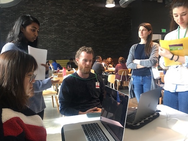
We recruited UX experts of different backgrounds because we wanted a broad UX perspective for expert feedback for our prototype. Through a Cognitive Walkthrough, our experts could work through tasks from the perspective of a user, think out loud, and call out design considerations.
B. Moderated Usability Testing - Sighted NCR employees
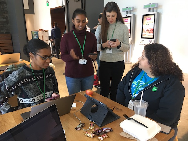
We asked sighted NCR employees to think aloud as they complete sample tasks with our prototype. Because our aim was for universal design, we included this audience to test with to determine if the flow and screens made sense to them.
Final Iteration
Accessibility
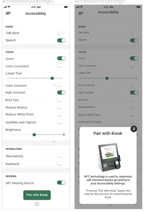
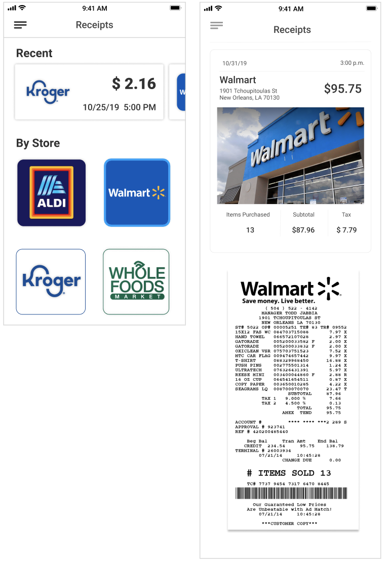
Since most blind/low-vision users have iPhones, we leveraged the iOS accessibility settings and allowed users to customize the kiosk screen with these familiar settings. Current kiosks do not have accessibility settings needed by most users with visual impaitments to use it properly. Additionally, users expressed difficulties viewing paper reciepts, so the app lets them save and organize their receipts.
AR Scanning
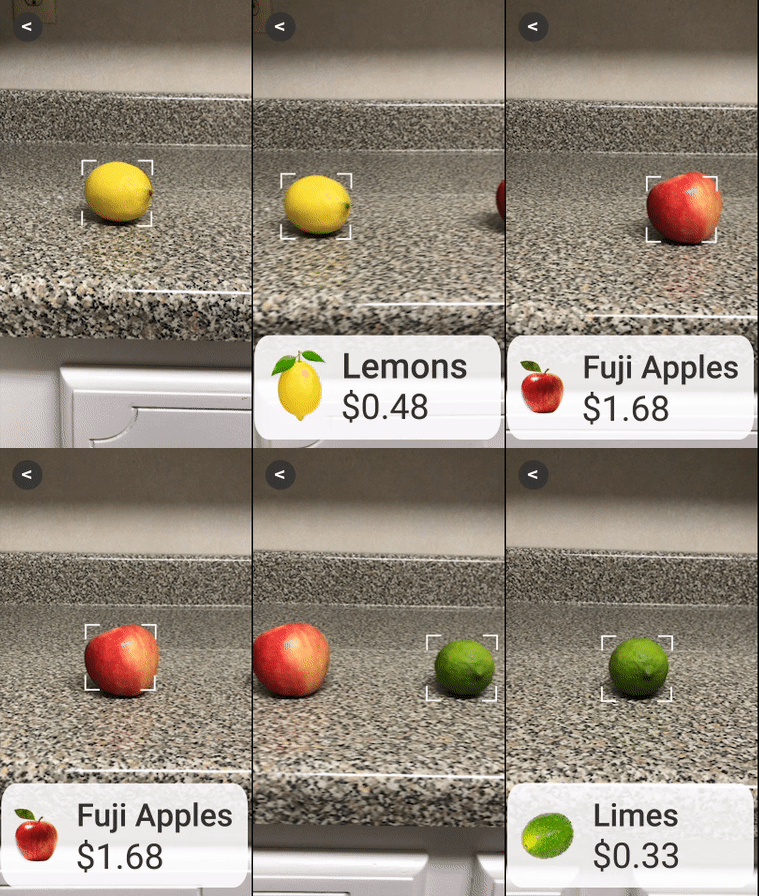
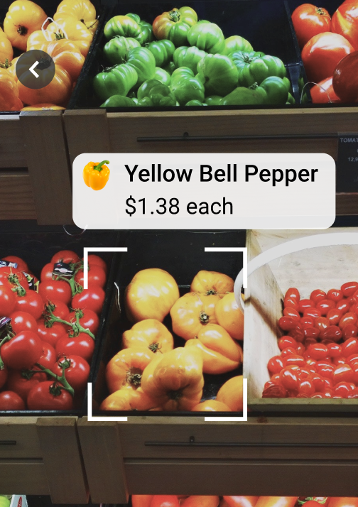
Since users have difficulty reading price tags and scanning barcodes, we simulated a high-contrast AR scanner that scans and give more information about items when the user's phone is pointed to it.
Store Selection and 3D Map
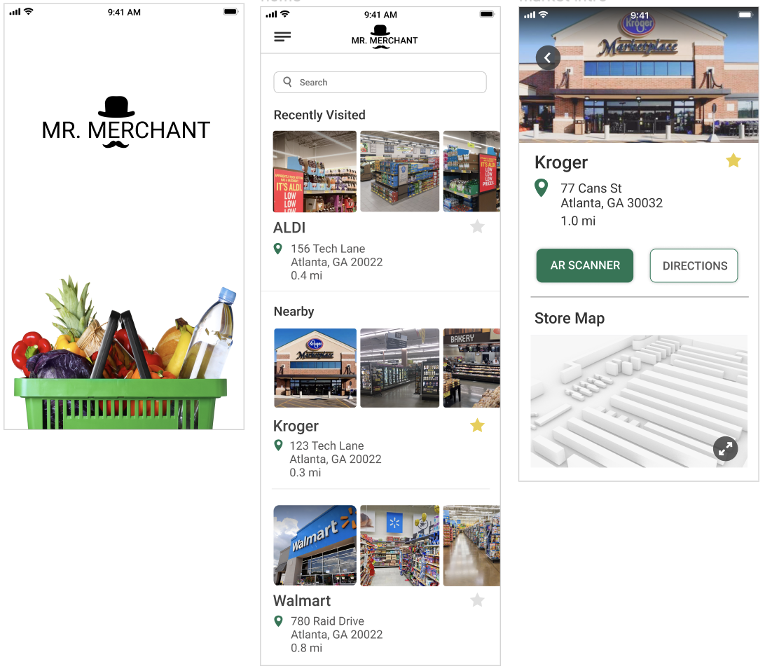
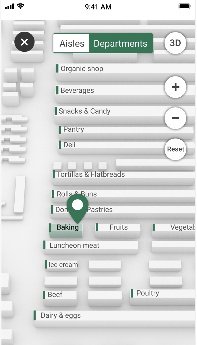
Users can zoom into the map to understand a store's layout. Additionally, a voice UI reads items scanned with AR scanner. Users expressed they learn about a store's layout before visiting, and totally blind users rely on a voice assistant to complete everyday tasks.
Pairing Screens - Kiosk & iPhone
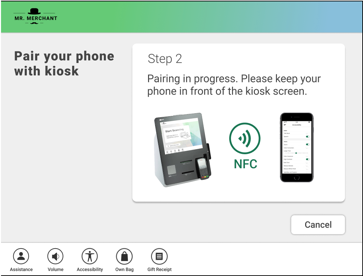
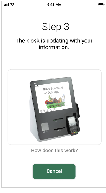
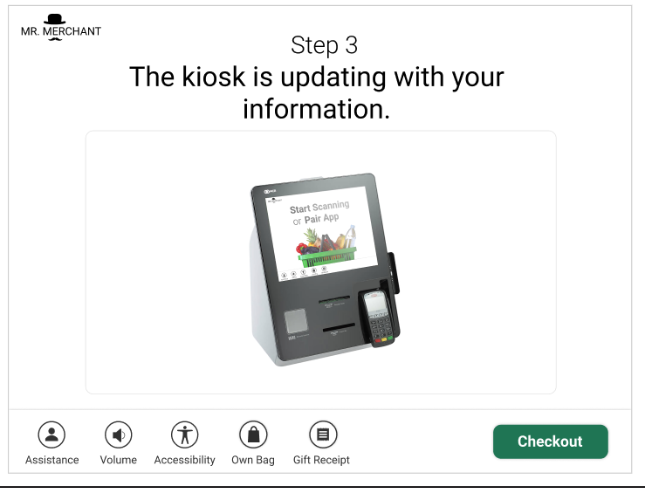
Users hold their phone near the self-checkout kiosk in order to send accessibility settings to the kiosk to customize the UI. The phone and kiosk screens will update in sync to give feedback to the user about the status of the pairing process.
High-Contrast Kiosk Screens
The kiosk interface was updated to align with accessibility design guideliens, such as high-contrast, bold fonts, text size, and more.
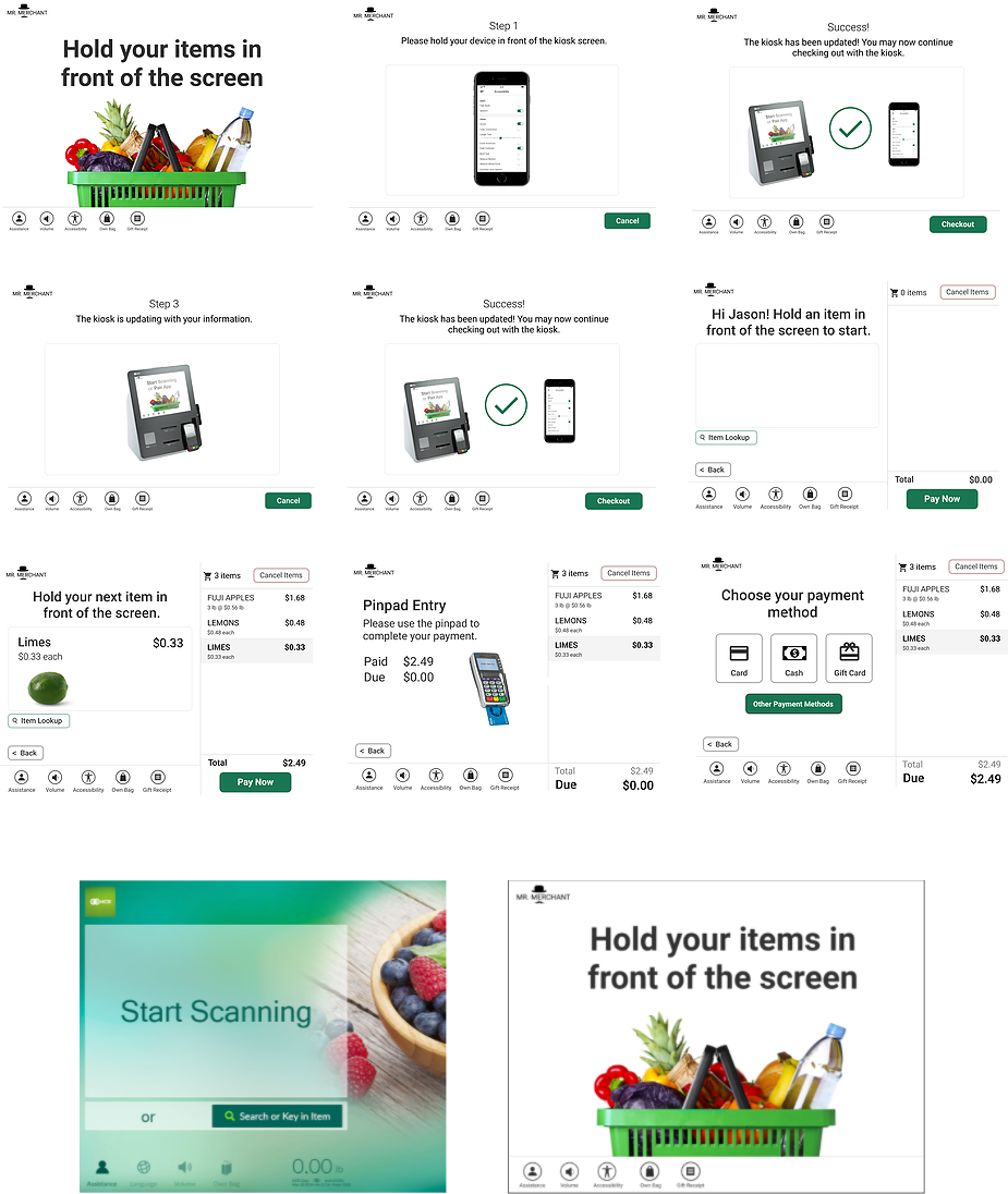
The old welcome screen vs. the new welcome screen
User Testing - Final Prototype
To evaluate our final design, I led user testing with low to no vision users (both real or simulated with visual impairment simulation glasses) and both Accessibility and UX experts. I developed the interview script to include sample tasks and a Wizard of Oz voiceover that would simulate the voice feedback the kiosk would give a user.
A. Expert Evaluation - 4 UX Experts and 1 Accessibility Expert
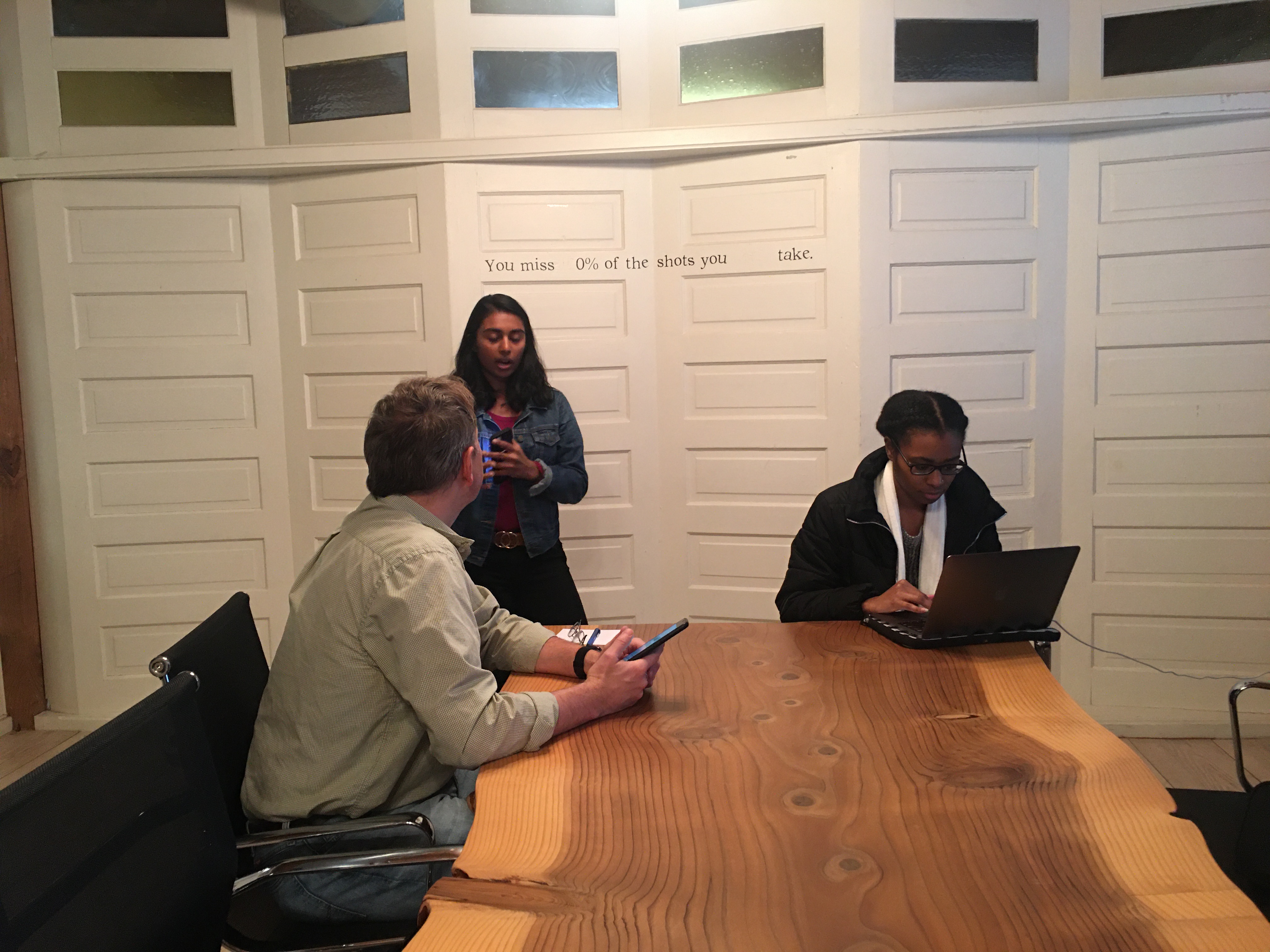
We recruited an accessibility and assistive technology expert with a visual impairment to understand how well our solution aligned with current accessibility conventions and preferences. Additionally, we recruited NCR UX experts to evaluate the intuitiveness and aesthetics of our final prototype.
B. Moderated Usability Testing - 5 Sighted NCR employees
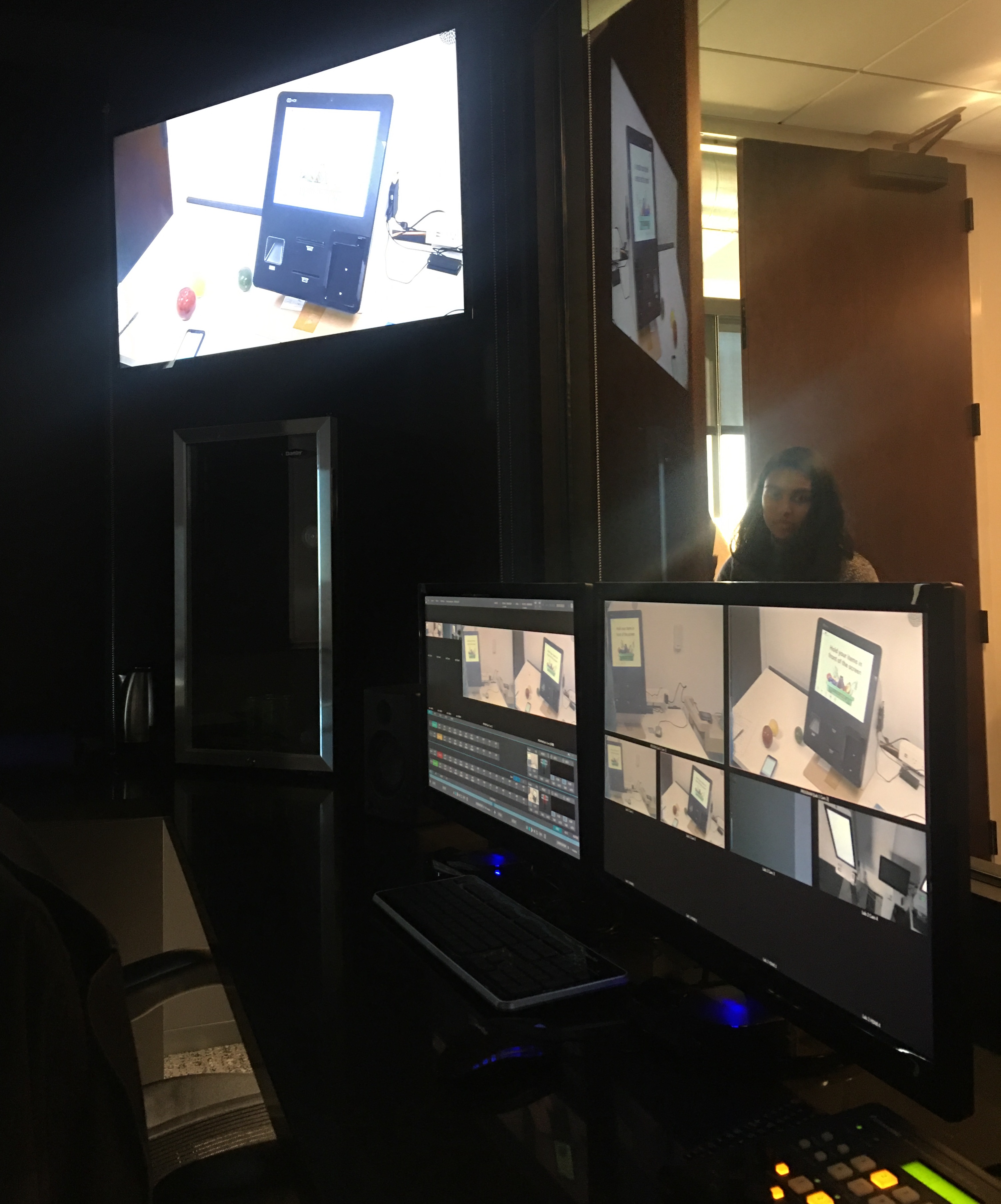
We used NCR’s Usability Lab to conduct this session as they had a model kiosk we could use for the session. I facilitated the session with each user as my team collected performance metrics and took notes. This method allowed for us to get quantitative data but also probe deeper with follow up questions.
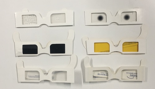
Visual Impairment simulator glasses that our sighted participants wore.
Reflection
I came out of this process learning so much about accessibility, industry UX Research, and collaboration with industry stakeholders.
If I had more time, I would conduct observation sessions of visually-impaired individuals using kiosks to understand their process and observe any pain-points in real time. I would also have more in-person testing sessions with visually impaired individuals (and focus on recruiting earlier).
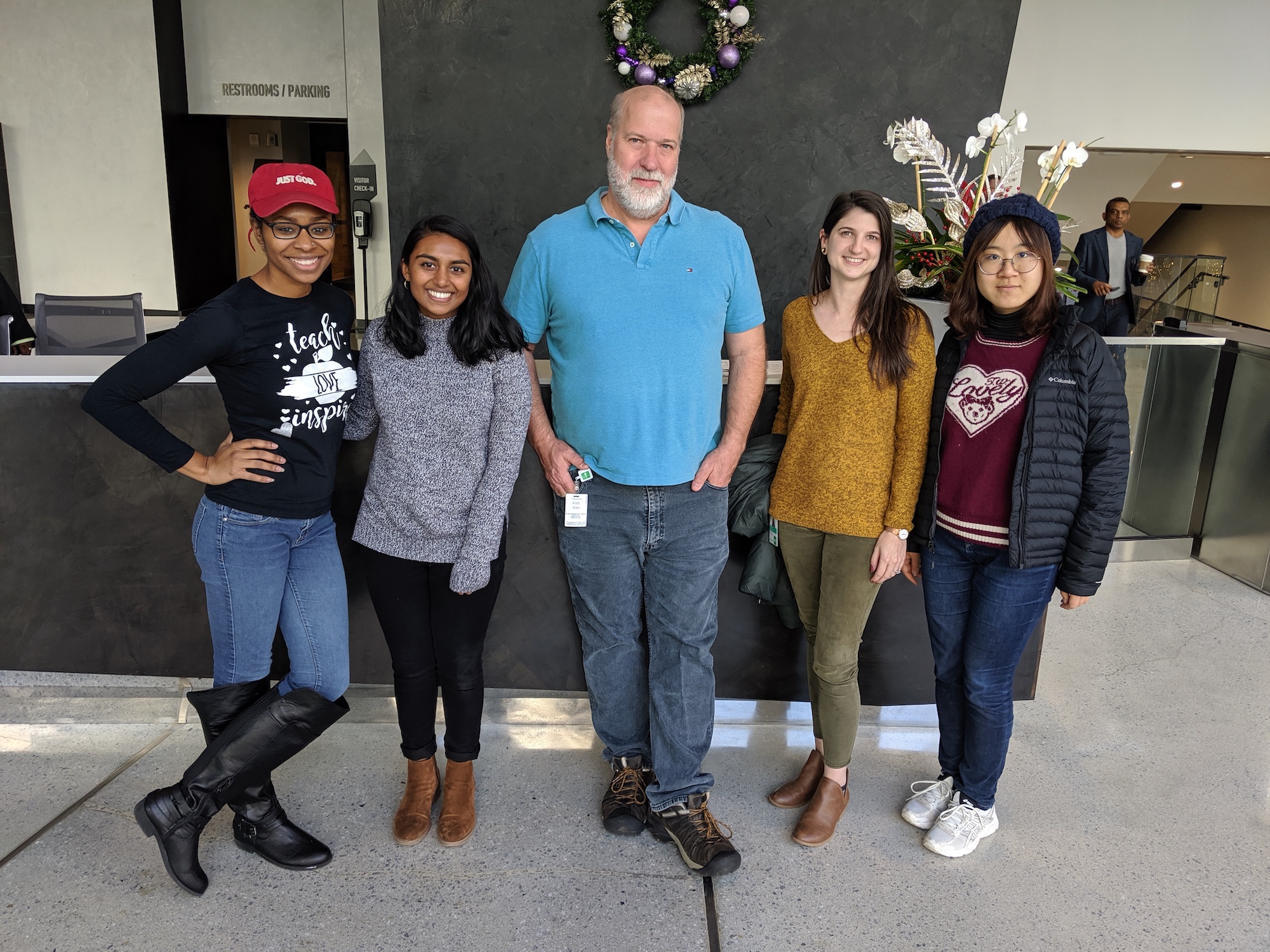
Morgan, Anjali, Bob and Kaylin from NCR (our mentors), and Yujin. Not pictured: Nektar.